Friday, 15 June 2012

Oh design scrapbook, it's been a while.

Yes, it's been a while. School's been busy, and a few weeks ago we were on work placements for two weeks to get a lay of the real workplace land. It was super fun. But this is about book design, because it must be.


Daniel J. Weatheritt, Dinosaurs: A Pocket Pop-Up,Walker Books, 2012.
Click on the images for a better view.
Yep, this is a post regarding a pop-up book about Dinosaurs. How cool is it though?! On the left is the little cute box that the book fits in to when it's all folded up. The bright red of that box was what actually caught my attention first when I was in the store, and the T-Rex on the front looks pretty awesome too. The title stands out wonderfully against the red background with the use of different colours. Also, I think having in capitals is a great idea - some people may disagree, but given the audience for the book, it yells the title at anyone looking at it, attracting them towards it. 
As you can see looking down the book, it covers a range of dinosaurs on nicely and different coloured backgrounds, and below you can see a couple of detailed pop-ups. 
The image on the front of the fold out part of the book itself is also striking and very detailed for a children's book. The yellow background attracts the eye and I'm sure would catch the attention of children. The title 'DINOSAURS', although it is difficult to see, is actually not fully black, but has a patterned effect on it to make it look older and faded.


GREEN!
Here are a few examples of the pop-up element of Dinosaurs. This book is clearly marketing towards young children through the people that would buy their books - adults. 
My poor photography attempt, apologies.
The colours on these pages are outstanding to me. They easily catch the eye, which seems to be a great theme through this whole book. 


The typeface used through the book, for the title, subheadings and text, is a sans-serif. For books the obvious choice tends to be for a serif typeface, however I think the use of sans-serif the right one. Since the assumption is this book will be read by/to young children, a simpler almost child-like typeface would be best suited.
I loved this little guy's face.


So that's my bit about dinosaurs - they're not my usual jam, but in this context they're pretty awesome. More posts to come.

Sunday, 13 May 2012

I bought a new book.


As the title would suggest, I did indeed get a new book the other day. It's Claude Lauzmann's memoir The Patagonian Hare. I'm very excited to read this, he's had quite an interesting life. Lauzmann, for most, is known as the director of the nine and a half hour documentary Shoah (Hebrew term for Holocaust). Very full on subject, and very long documentary. What many people don't know is he was also great friends with Jean-Paul Sartre, a lover of Simone de Beauvoir, and a member of the French Resistance at 16. I heard about the book from this article with him by The Guardian. Any who, this is about the design of this book, which I think is beautiful and traditional. 

I'm not sure if anyone's read my previous posts, but I've mentioned before that I love auto/biographies/memoirs. There's just something about a person letting you in to their life that gets me.
Clothed, Farrar, Straus and Giroux NY, 2012,
designed by Jennifer Carrow.
Click on the images for a better view.
The yellow spine with black writing would definitely strike the eye if this was stuck on a bookshelf - which would be a tragedy (I special ordered it, I'm not sure how many book stores will have it in stock). The picture comes from Lanzmann's own collection, and uses his writing for his name and the title. He's even drawn FSG's logo by hand on the spine. So we have yellow, black and white, and a dark grey on the back, where white text tells us of the praise for The Patagonian Hare, which is high and why I wanted it. The layout is simple and not crowded, making it easy on the eye. Also having the title in the yellow circle is an easy way for the designer to get around having text on an image, and draws the eye to find out what this book is.


Naked.
The naked version of the book is so simple, I find it just as striking as the dust jacket. On a light grey, we again have Lanzmann's handwriting telling us the name, and nothing else. I enjoy the layout of this also, keeping the text running down the spine changes is up nicely from the dust jacket, and means we lazy readers don't need to move our head or book to read it. Win, win.


Text block. Taken with my phone, the black marks on the left aren't on the book.
So I might be biased because I can't wait to get stuck into this book, but I really think it's beautifully designed in every way. The chapters have no titles, and are indicated by very simple headings as seen to the left.  I'm a fan of spacing on a page (white space is not evil people!), and the layout of this is great. The text block sits closer to the centre of the book and slightly higher on the page, giving it a more traditional feel with wider margins. I think the text is simple and easy to read, the running headers give the title and author's name, and each chapter starts with a two line drop cap. The typeface in a nice and easy to read serif, nothing too fancy. The simplicity is beautiful.


Image, just one. Lonely, you might say.
Now to pictures. This whole book only has one picture inside, which is shown here. This surprised me, but I'll survive. The image is black and white, sits in the same place the text block does, and is explained in the text on the facing page. The text finishes about halfway down the page and says "This is it:", guiding you to the picture. The thing I enjoy the most about this is there's no attempt to keep the text running on that page, or to cram the image on to it to save room. The image is important, clearly, and the author and designer wanted to make it stand out. The story does carry on from that point, and probably could have had the text run on; the choice not to is a great one in my opinion.


I'm excited for this book, and have no doubt you'll read all about the content when I've finished it.


More scrapbooking to come soon.


K

Saturday, 5 May 2012

Book Design Scrapbook

An assignment for my course this year is keeping a scrapbook of book designs. This includes everything from the cover image to the binding to running headers to the use of images. In an effort to not print off copious amounts of colour images, I've chosen the digital format for my scrapbook - obviously. I'll be nice to some books, and slightly mean to others, but only if I really don't like them. Apologies in advance if anyone takes great offence to what I write. Hopefully I don't bore you all to death, and feel free to comment on any of them!
I figured the best way to start any scrapbook about books is to start with my favourite one. And yes, it is The Catcher in the Rye. Don't be mean. Holden helped me through some tough times in 7th form.
J. D. Salinger, The Catcher in the Rye, Little, Brown, 1951. Cover design by E. Michael Mitchell, author photo by Lotte Jacobi.
\Click on the images for a better view.
This is the first Book Club Edition of Catcher. Apparently Salinger asked for the photo to be removed from the back, and subsequent printing does indeed lack this. I like the idea of a picture of the author being somewhere in the book, and this photo of Salinger is a really nice one. However, considering his actions towards the public throughout his life it's not surprising he did.
I'm a big fan of this design. The cover image and spine easily catch the eye with the bright red and yellow, and anyone that has read the book will understand the significance of the carousal horse. The red and yellow are a theme in other editions - one of mine (published 1984) is a very plain red cover with the title in yellow. The use of a serif font for the text makes it easy to read, as well stand out.
The edition in most book shops around town at the moment is shown below.
Published by Penguin, 1994. Thanks to Mum for her excellent holding of the book.
I enjoy this design too. I feel it reflects the original design with the colours, and the faint lines reflect on the narrative style of the book. The very basic serif typeface that's used is perfect, just like in the top example. It mirrors the inside content as a narrative, and makes it so easy to read and follow. The more simple design of this (and other editions) of Catcher are a note on the popularity of the book, I feel. People will pick up this book not only because it has a simple yet eye-catching design, but also because of the title. Most people know of Catcher, whether they've read it or not.
The other edition I own of it is plain silver. Just silver. This was the first copy I read after Dad gave it to me, and the plain cover didn't bother me - I just wanted to read the book that supposedly killed John Lennon.

This post is slightly longer than most will be, but it will feature good and not so good designs. Feel free to give me any suggestions!

K

Sunday, 22 April 2012

New job = no more retail.


So I got a new job. This is a very exciting time for me; it’s my first non-retail job and, in theory, will mark my transition from retail into big girl work forever. That is if I get a publishing job at the end of the year. Although this job will exist until around 2014, so I guess I’m set to not work retail again.

I've been working since I took over my sister’s paper run in Taupo back when my age was a single digit. Since then, I’ve worked in a bakery, sold home goods, made smoothies and salads, given advice on a variety of sporting goods, as well as sold books, organised your post and taken your coffee orders. There’s also a chance I’ve also yelled at you if you were undergrad at some point in the past two years.
I quite like my CV, it shows the crazy amount of things I’ve done since 2004, and there’s never been a job I didn’t like – just ones that didn’t turn out quite as well as I’d have liked in the end.

ANZAC Cove, from my school trip in 2006. 
So this new first non-retail job of mine is at Archives NZ. Fancy, I know; I even get a swipe card with my picture on it. I’m in the Digital Copy Centre from 7-9am every weekday scanning NZDF World War I soldier files, so they can be uploaded to Archway. From here, anyone can access them. I’m an easily distracted person, so I listen to music while working in an effort to concentrate better. However, that doesn’t stop random words and sentences jumping out at me from the files.

I had the file of a soldier who had previously served two years in the Army but had been discharged; the reasons for this weren’t given. However, he was deemed medically unfit to serve in WWI due to problems with his eyes; I assume this may have been the reason for his discharge. Just his willingness to serve for his country made me think a lot about what must have been running through his mind when he signed up and was told he couldn’t fight. Makes you wonder.

The other day I had my first Killed in Action soldier. Which was followed by another one. And I just couldn’t stop thinking about these men, who had both died early into the war, how they were just young guys that probably thought they were invincible, going off on their daring adventure and never returned. Since that red ‘K.I.A’ stamp was struck down on the yellowed paper, there’s a chance I’m the first person since then to touch this record. The NZDF have gone through and put some of the papers on to microfilm, so those chances are greatly diminishing, but there’s still something special to me about being the person that gets to digitalise and immortalise on the internet soldiers’ lives and service records. People use Archway every day; families to find their loved ones, schools for projects, and I have no doubt Historians use it for research.

A poppy wedged in to the NZ Memorial
at Gallipoli, 2006.
However, the one soldier that has really jumped out and stuck with me was a gentleman who began his service in 1918, but was discharged in 1919 due to being “no longer physically fit for War Service on account of illness contracted on Active Service”. Bit of a mouthful. The main reason this man stood out at for me, though, was his occupation. Neatly written at the top of his history sheet was ‘Bookbinder’. Bookbinder. There are thousands of files to scan, and I happen to pick up a bookbinder’s. I thought it tied my current study and his life together quite well.

I said earlier this scanning job will exist until 2014; Archives have said they will digitalise all NZDF WWI personnel files by 2014 – the centenary of World War I. This job fuels my love of History while I’m busy studying to be a publisher, instead of doing History Honours as I intended. This beautiful balance between work, study, and lifestyle is more than I could ever ask for; 2012’s coming up great so far.

Monday, 9 April 2012

This was my Easter weekend.

This is how I spent my Easter weekend: whatshouldwecallme.
You will love it.

New post coming soon, like a real post I mean.

Hope everyone ate WAAAAAY too much chocolate.

A picture I liked. Plus a movie I love,
and will probably watch today.

Thursday, 29 March 2012

W&R 2012 - the final post.


After the ‘Last Real Book Readers' session, it seemed like a good idea to sign up to Twitter. Others in my class were following various book industry folk, and I felt left out. It seemed the most common factor in all of their followings was Helen Heath from VUP. The advantage of following her meant my budget of $40 for W&R sessions wasn’t stupid – she was at the majority of sessions and reading her tweets made me feel like I was in the audience. So for that, Helen, I thank you! And if you like Twitter, find me - @kimaya__m.

The next session I headed to was Germaine Greer on her 2007 novel, 'Shakespeare’s Wife'. It was a very last minute decision to attend this session, and we did have to wait in line for a while to get the tickets. Totally worth it. The Embassy was packed out for the session, and I found it nice that people wanted to hear about Germaine’s first love – English Literature. She did her PhD at Cambridge on Shakespeare’s early comedies, for those that didn’t know. Linda Hardy from Victoria University was in conversation with her, and they worked very well together I felt.

Stunning lady.
(c) Writers and Readers website. 
Being super excited about listening to Germaine, I didn’t take notes again. Sigh. The main quote I remember from here that really intrigued me was “his plays are enough, he doesn't have to be a good man too.” She talked a lot of her fellow Cambridge scholars, including Stephen Greenblatt). Her main reason behind talking about him was that he pushes for Shakespeare to be a great man in general, as well as the greatest playwright this world has seen. However, Germaine destroys all these boundaries by asking the questions no one ever thinks to ask – did he really just leave his family to find his wealth? How did Anne Hathaway survive with the children alone? She must have had help – where did it come from? Did she have her own fortune?
By asking the questions and pushing these barriers, Germaine shows she’s not only a hugely significant feminist voice of the 20th Century, but also an extremely intelligent woman (not that she isn't without Shakespeare) with an incredibly strong way of making history shiver in its boots – simply by questioning it.

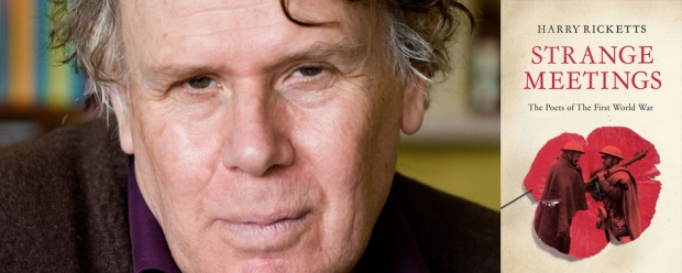
The last session I made it to was Harry Ricketts in conversation with Ingrid Horrocks, who also launched ‘Just Then’ at the launch on the Saturday. Ingrid had definitely prepared and knew exactly how to make this session flow. The session was called ‘Strange Meetings’ – named for Harry’s 2010 biography of World War I poets. I picked up a copy of this the day it came into the store – having studied WWI poets in sixth form at school, I picked up a passion for the subject. The book includes real meetings that happened between poets, as well as imagined ones created by Harry to create a stunning cross between fiction and non-fiction. The research and imagination that Harry put in to writing this book is really amazing.

Harry and 'Strange Meetings'.
(c) Writers and Readers Website
Biographies and autobiographies are easily my favourite genre of writing, there’s just something about that person allowing you to share their life that I just love. Harry said of them “the best biographies are when it seems the biographer is being haunted by the subject.” He is well known for his biography of Kipling and said he did the book because he felt he was growing up at the end of the ‘Kipling World’, being the 1940-50’s period. There’s always got to be a love-hate relationship going on with your subject, otherwise you’ll, apparently, just grow to hate them. And there are definitely things to love and hate when it comes to Kipling.

With ‘Strange Meetings’, it apparently took Harry three years to figure out the structure of the final product. As I mentioned, there are real meetings and imagined ones; one of the imagined ones is between Edward Thomas and Wilfred Owen. Harry said it’s very likely that Thomas met Owen as they were at the same training camp, and so he wrote three versions of what may have happened – one that is likely, one less likely and one that is even less likely than the previous two but would’ve been the best scenario. The book is so well written, and after reading one in particular, I had to put it down for a little while due to its mildly depressing nature. But totally stunning book, if you're into the subject, I highly recommend looking in to it.

Harry is also known widely as a poet, and an audience member asked how he gets his poems to their final standard. His answer? “I just fiddle around with them…Muck around for ages. I have no idea where a poem is going to go when I start it.” I found that simply great – I’m sure no writer knows what they expect out of a piece when it starts, and that’s definitely the way things should be written. For example, when I started this blog I had no idea how it would go, or where I wanted it to go. Hopefully somewhere great in the end. As this session did; I walked out, headed straight for the signing desk and had Harry sign my copy of ‘Strange Meetings’. After prompting him my name, he looked up, remembered who I was and we had a nice chat. Still getting my network on. Excellent.

And then it all comes back to twitter - After Harry finished I tweeted: "Harry Ricketts: Making non-fiction writing and poetry look easy since (insert date here.)" It's true.
But then Helen tweeted this when W&R week finished: "Merging #writersandreadersnz themes: Writers help us find ourselves in the past & in universal stories. Just Write." I think Helen's is probably better than mine. She definitely summed up W&R Week 2012 super well in 140 characters.
My sweet collection from W&R 2012.
Writers and Readers Week 2012 was easily a highlight of the first few months of this year. It started, for me, through a chance meeting at some work drinks, which led to attending my first session, and things just snowballed from there. I feel this year is going to go well.

Watch this space.

Friday, 23 March 2012

W&R: part the second.


Lucky for me, when I bought my ticket to Emerging Writers, I also picked one up for ‘Are We the Last Real Book Readers?’ We’d been told about this session in class, it’s a very interesting time to be in the publishing world with the digital age of books clipping our heels.The panel was chaired by Radio NZ’s Kathryn Ryan – her opening speech mainly consisted of how she loves the smell of books, I do too, but not enough to say it more than once; nonetheless, she was definitely a fine choice for the role.

(c) Writers and Readers website. 
L-R Fergus Barrowman, Tilly Lloyd & Denise Mina. 
First to speak from the panel was Tilly Lloyd, manager and co-owner of Unity Books. Coming from a book background myself, I understand the damage digital resources are doing for a lot of independent bookstores, but it’s most excellent that Unity is still going strong. It’s hard to imagine a Wellington without it. However, I won’t lie, I didn’t start taking notes until Fergus Barrowman, the publisher at Victoria University Press, started talking – not because Tilly wasn’t interesting, but because I completely forgot I had my notebook in my bag. I do believe she said that books would become like horses – taken over by cars and trucks, but still around and definitely not obsolete. But apologies Tilly, and if anyone remembers points from her, please comment!

Oh, and Fergus then decided to tell us that an article he read said that if we had an industrial breakdown, there wouldn't be enough horses in the world to breed us back to the numbers the world had in WWI. So that’s interesting, huh?
Anyway, I found it super interesting that Fergus uses his ipad for all of his manuscript assessments – I find reading on a screen way too hard after a while. But as he said, and this has stuck with me, digital resources are “good enough” for most people. They don’t have to be excellent yet, because perfection in e-reading doesn’t quite exist, it just has to be good enough. Like most things in our lives. Fergus also noted that VUP had seen a drop in their non-fiction sales. This he said, and I agree with, is due to people not wanting the entire story in non-fiction. They want to drop in and out of the story for small snippets of what they need to know. As a student, I totally relate to this – for essays, I’m all about google books and doing a simple ctrl+f to find the keywords I need. But this isn’t to say I don’t still buy and read non-fiction. It’s easily my favourite genre of new books being produced, especially a good biography.
Her latest book,
if you're in to crime.

Last on the panel was Scottish crime writer Denise Mina. Heard of her? I hadn’t. But, bro, she was excellent. According to some statistics she had, the majority of authors in Britain make around £6000 a year, while there are five authors in Scotland that make over £100k a year (and I totally assume she’s one of them). She talked a lot about how the industry’s changing so you don’t need agents or publishers. When she first met her agent, she bought a new jumper from the 2nd-hand store for the occasion, and couldn’t understand them because apparently all British agents talk with no vowels in their words. But the point is anyone can be a publisher without the scary middle man - just write a novel, make it in to e-format and sell it for $1 on Amazon. One thing – she hates Amazon. Man, I mean, she is not a fan. The main thing I gained from her was we must crush Amazon if it the last thing we do.

However, I did pick up one more interesting point from her. Denise talked about (I feel she said she got it from Ian Rankin...) books becoming much like vinyl. Nowadays when you buy a record, like I still do, it comes with a code to download the digital file for free. She believes this is what will happen with books, which I’m pretty ok with. I haven’t acquired an e-reader yet, and don’t think I will unless I get an awesome job where they give me one, or I go travelling. And I’d much rather buy the real pretty book that can sit on my shelf and have the digital file for free, than just buy it boringly off the internet and not have anything physical to hold.

Now this was supposed to be the last post about W&R, however this post has become longer than the first one already, and I still have two more sessions to write about. Soooo, there will be a third. And it will be excellent. It’ll be about Shakespeare and WWI poets. Yus.