Wednesday 27 June 2012

Rebel, Rebel.

Don't worry, my face isn't a mess. I was just given dirty looks by three different staff members at Whitcoulls yesterday while I took pictures of a book. It's actually an older book than I thought, but it's very pretty and ties in to an app that Faber and Faber released. It is, of course, T. S. Eliot's The Waste Land
Lookin' pretty swish on the shelf.
Edited by Eliot's second wife, Valerie, after his death, the book consists of facsimiles and transcripts of his original drafts. The transcripts clearly translate Eliot's incredibly messy handwriting and original comments, as well as comments by Valerie and annotations by Ezra Pound. The cover, as you can see above, is nice and simple but stands out well on the shelf. I was just killing time in the store, but saw this and started taking pictures of it. Here's a close up of the cover.
Someone likes three colours.
The cover is so simple and elegant I love it. The red lines make the title stand out even more than it already does, and ties in nicely with the F&F logo. Some may not like the use of all caps for the cover, but I don't mind it. I also love the constant use of a serif font, which is consistent throughout the book.
Inside flap and half title page.
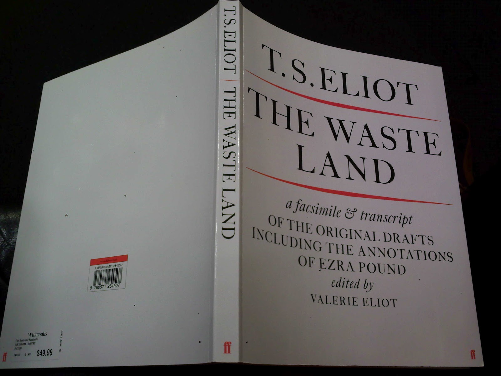
Also by and title page.
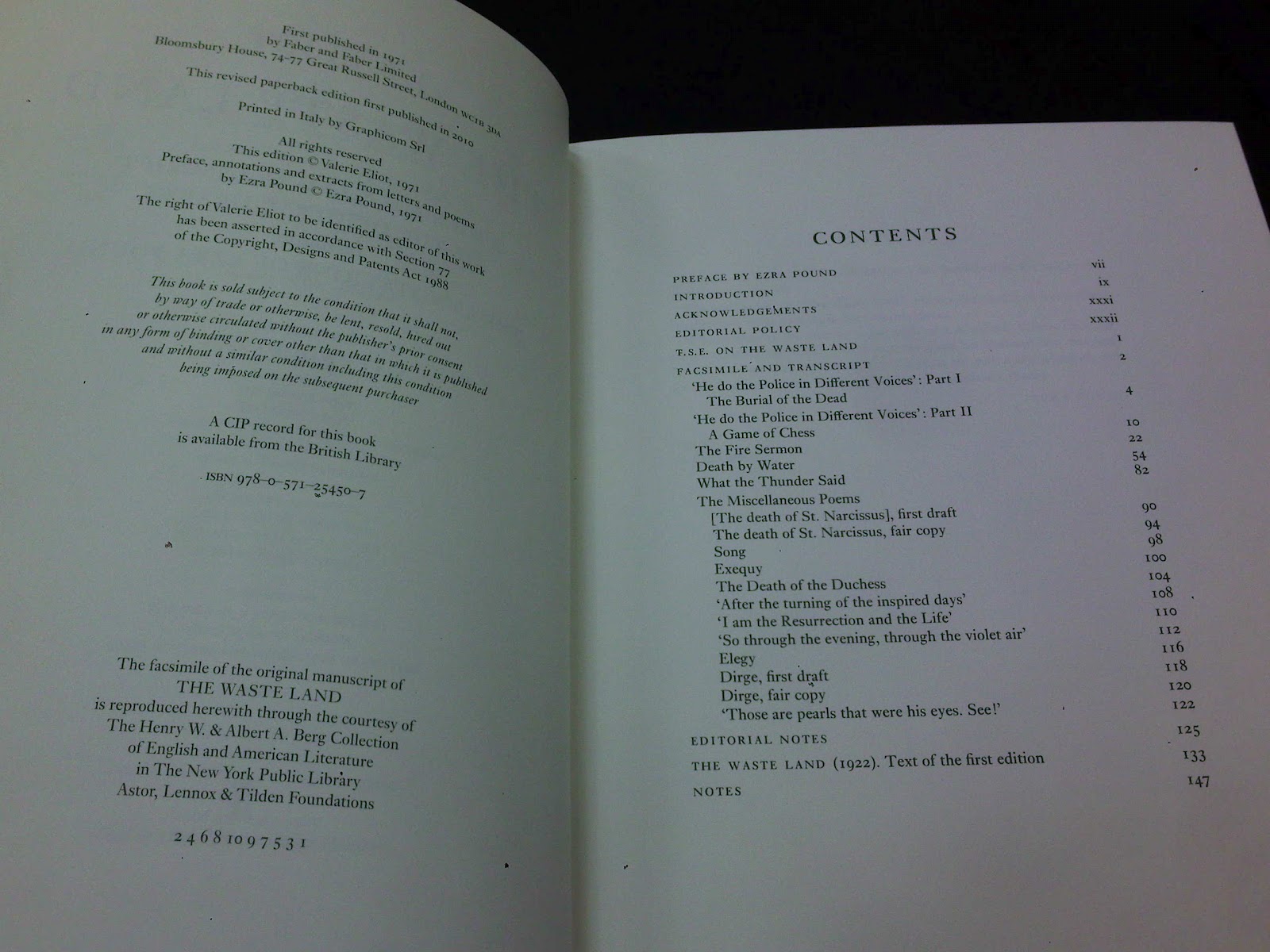
Imprint and contents.
Editorial and quote.
Here are all the prelim pages, starting with half title, other works and title, imprint and contents, and editorial note and quote. All of these pages use the same serif font found on the cover. All of these are super-easy to read, the use of caps, roman and italics are all very appropriate, helping guide the reader to important details.
Inside page.
This is the only picture I took where you can see the page number for the book in the bottom right-hand corner. Now take a look at the picture below. As you can see in the centre top of each page, the page numbers are shown from the original text. The use of square brackets around the actual page numbers help the reader to tell the difference between the two sets of numbers, while keeping the integrity of Eliot's original work.
Another example.
Also, as you can see, the attention to detail held in each reproduced page is immense. They have thrown lines through at exactly the same angles (check out below for more examples). The editorial note explains that Pound's annotations are in red, Vivien Eliot's (his first wife) are in italics, and the rest of them are Eliot's. The use of colour and formatting to show the different points of view on the text is great for someone studying Eliot's work, or even just an interested reader.
The detail in the reproduced pages is fantastic, I can barely read Eliot's handwriting in most of the pictures, but his wife clearly knew what he was on about. 
This one's my favourite. Clearly attacked by Pound, the second to and last paragraphs show red lines crossing through the words just like on the opposite page. Lines come sprouting off, circles surround clumps of words, and once vertical writing becomes easy to read.


This is an excellent book, worthy of anyone's shelf. Plus Eliot had a super interesting life, just take a look for yourself.


More to come, K.


No comments:

Post a Comment