How good is that? The title of this post has a double meaning - there's one more day left until my assignment is due, and it's the name of a fantastic song from the greatest musical ever. Yes people, Les Miserables. It's not secret that I love it. So much. My sister and I saw it in 2010 on the West End, and below you will see pictures from the booklet created for the 25th anniversary year of the show.
Here's the cover spread to the booklet. It's a simple stapled booklet, all printed on a nice glossy stock. The cover uses the well-known symbol of Les Mis, the illustration of Cosette by Émile Bayard. The typeface for the title and other text is one I think was created for the show - it's become the expected sight for Les Mis. The colours of the cover catch the eye, however I'm sure you'll be buying this more because of the content than the cover. The back image is taken from the show - Enjolras waving his French flag during the battle at the barricade (see, told you I love it). As this is for the 25th anniversary, the text at the top in yellow stands out and catches the eye against the smoky-white background.
Here we have the first pages when you open the booklet, apologies for the glare on the left. The typeface for the title is the same as the front, as is the names of everyone on the left - they're also in all caps. This helps to distinguish the names from their roles for the reader, as well as just making it easy to read. The roles of people are in italics, and in a different, very basic sans-serif. This is surprising given the amount of text on the right side here, and in the pictures below. I do like the use of a column for the text, it doesn't take away from the images and the page, but is still prominent enough as it should be. The white typeface works well on these dark pictures, and it continues throughout without being an issue. The use of the red banner in the background gives stunning colour to the page, while tying it back to the image of Enjolras dead on the barricade. Sad.
The top says 'Victor Hugo - France's Favourite Son'. So what better picture to accompany him than that of the 'Lovely Ladies' (prostitutes), and Fantine on her deathbed with Valjean. The top picture of those lovely ladies does look fantastic, the red/pink colour comes from the lighting in the show, but beautifully catches the eye. However, my favourite part about this spread is the end of the text on the right. The picture of Valjean and Fantine stretches behind Hugo's life story, which is in columns with a ragged-right edge. But the last column of text has had it's ragged-right adjusted to fit around the two figures, and not covering them up at all. The curved edge catches the eye, and makes the text easier to follow for the reader without affecting the picture.
I just really loved this image. This is the cast I had the pleasure of seeing (with an incredible understudy for Valjean), and my, it was amazing. I was crying right from the get-go. But to this page. This is one of the only pages I have in the scrapbook that's just an image spread. The serif typeface in the top left-hand is beautifully simplistic, coming from the song One Day More just before half time. The typeface gives the impression of a song lyric, flowing, easy to read, and a bold statement. All this while the picture underneath gets has some fantastic, uplifting light coming in from the right, and everyone looks amazingly photogenic while still singing. Gee whizz. As I said earlier, I'm sure you'll be picking this booklet up because you know the musical, and this page has a powerful message behind it, if you know what you're looking at.
Last page, and last picture I'll look at from this. Top left corner, another fantastic image with my favourite line in the musical - 'To love another person is to see the face of God'. I'm not religious, in the slightest, but in the context of the musical, and when you see Alfie Boe's face when he sings the line, my heart just melts. But the issue I have with this image and text is the last few words get a bit lost in the white of Cosette and Fantine's white dresses. It's nice that the designer kept the white typeface consistent, but this part lets it down. As for the rest, every image in number with a small white number in the left-hand corner of each picture. These numbers have a corresponding caption at the bottom left-hand side. This page is to acknowledge the past, present, and international productions of Les Mis, which is what each of these pictures show. This spread is busy, however I think the designer has managed to make it work. The reader can still follow it, and if you really want to know what a particular picture it is, it is easily searchable.
I think we can all safely assume I love Les Mis. Apologies for the rant, but it's just so good.
The end is almost here!
K.
Just some thoughts on books, culture, and life from a small corner of the world.
Showing posts with label Serif. Show all posts
Sunday, 8 July 2012
Friday, 6 July 2012
Last pages geek-out.
As I mentioned in the last post, I quite enjoy the last pages in non-fiction books - that is the bibliography, index, glossary, etc. I am awesome. When I finished my degree, I got rid of most of my textbooks, but luckily my boyfriend's still got a couple. (already featured on the blog.)
| Glossary. |
| Bibliography. |
As these are the same book, the page layouts are all the same. Using APA style, the bibliography is easy to follow for those people that actually need to look at it. The same serif and sans-serif are used for the body text and headings.
| Index. |
And to psychology!
Here's the glossary from Psychology 7/e. The margins are nice and large, creating a nice spacious page. The title is a good distance from the top of the page, helping the reader to know where to start. The word in the glossary is in bold, with the definition starting a small indent in to the right. Again, this is helping the reader to easily find words, and read the definitions. The page number in the bottom right has corner is B1, which helps to distinguish between the main body text, and the bibliography sections. The following two pictures are a part of this B page section as well.
Being a fancy textbook, and rather large too, this book has a name index. The title starts at the same place as the glossary, keeping things consistent. The names are listed alphabetically by last name, followed by the every page number that that name appears on. There's a small line at the top, in the same size typeface as the rest of the page, which explains the finer points.
Here's the subject index of the book. It's very similar to the index in the media book above. If a main heading has subheadings underneath, they are indented by around five characters to help the reader distinguish the difference. Like the name index, the page has the small text at the top to help the reader understand what each number and their certain formatting means.
Almost done!
K.
The Babysitters Club, part two.
Here in New Zealand we have an obsession, and that's with cookbooks. I don't know why, but we do. While babysitting I took note of a couple, including one by my favourite, Jamie Oliver. You may think Nigella is my favourite, given my post about her, but I love Jamie, he's just wonderful.
| Michael Joseph, 2000 |
Following the success of his first book, The Return of the Naked Chef was published to accompany the BBC series The Naked Chef. Look at that grin on the front! That's what sells these books, Oliver's insane passion for his work and that he's the son every mother wants. The spaced, uncrowded cover design makes it a pleasure to look at. Oliver's yellow top and grin catch the eye easily, and the giant JAMIE OLIVER will make you look at this because, let's face it, he's great.
I think my favourite thing about this book is that no page is wasted. No doubt this book would have been expensive to produce, but since the sales would've been fantastic, no cost is too high for Jamie. A nice, simple, and spaced sans-serif is used consistently throughout the book. As a beautifully illustrated book, it makes sense to use the spread to show the picture of Jamie cooking in all his glory for the title page - it brings it home that it's all about him and his cooking just by turning to the first few pages. It's well acknowledged by Jamie that he has Jules, his wife, in his life - he never hides the fact, which I'm sure wasn't the BBC's idea. The dedication to her is simple and lovely, I let out a little 'aww' when I first saw it. The red of the typeface is repeated throughout the book, and as the first instance, I like to think it shows his love nicely. The imprint is simple and traditional - using a serif, and not trying to be something it's not. The contents uses the same colour from the dedication, as does the introduction coupled with a lovely picture of the man himself again. The introduction is very 'Jamie', and as the text goes right to the ends of the page I can imagine there were some issues with the cutting of the book at the printer. I love the simpleness of the contents page - very basic, spacious, and super easy to read. The designer didn't feel the need to fill the whole page with useless information, which is much appreciated since I find cooking books can be daunting.
Here are two examples of section markers, which are listed on the contents page. Each of the section markers are a double-page spread in black and white. The marker on the left, fish and shellfish, shows Joe, Jamie's regular person at the market. The homeliness of this picture brings the book back to Jamie and lets the reader in to his life. The typeface is the same sans-serif, with Joe's name in the same red as before, and the section title changes colour from black to white depending on the most appropriate one. This is a great choice, changing it if need be, as I've already said in a previous post, it can be a disaster for the reader to stick to one colour.
Instead of looking at the obvious recipe for the last picture, I though I'd look at the actual last pages of the book, or at least the index right now. The margins around the text block are traditional in sizes, giving the reader plenty of room to hold the book open when need be. The bottom right-hand side has a nice running header and page number, and due to the margin it's easy to locate this. The list of recipes are easily formatted with the main ingredients in the same red, and recipe titles in black. The page numbers in roman are the recipes themselves, while the bold ones indicate illustrations; a v on the left-hand side offer vegetarian recipes. I really like the last pages of books - I love non-fiction as a genre, and would like to learn more about bibliographies and indexes. Yes, I am that cool.
Almost done for the scrapbook, look forward to it!
K.
![]() |
| Section markers |
Instead of looking at the obvious recipe for the last picture, I though I'd look at the actual last pages of the book, or at least the index right now. The margins around the text block are traditional in sizes, giving the reader plenty of room to hold the book open when need be. The bottom right-hand side has a nice running header and page number, and due to the margin it's easy to locate this. The list of recipes are easily formatted with the main ingredients in the same red, and recipe titles in black. The page numbers in roman are the recipes themselves, while the bold ones indicate illustrations; a v on the left-hand side offer vegetarian recipes. I really like the last pages of books - I love non-fiction as a genre, and would like to learn more about bibliographies and indexes. Yes, I am that cool.
Almost done for the scrapbook, look forward to it!
K.
Wednesday, 4 July 2012
Amazon, you ol' dog you.
I've said it once, I'll say it again - I don't particularly care for ebooks. Due to my lack of one, and lack of being organised in the slightest, all of the following pictures have been borrowed from the internet and the caption will send you to the original link.
I'm going to look at the Kindle, I've got pictures from the touchscreen, keypad, and the other one that's not either of those two. I'm not looking at the Fire, as I just want to focus on the ink display. Kindle, as we know, was created by Amazon, who is taking over the world. I don't want to get in to it, mainly because I'm super tired but also because that's not what I'm here to talk about. Instead, design. Let's start with a cover. Naturally.
![]() |
| Left - http://bit.ly/O3euGx; right - http://bit.ly/R8Y56P |
Here we have One Summer, published in 2011 by Grand Central Publishing. However, on the left, the 6" E Ink display Kindle, retailing for $109.00 on amazon.com right now. On the right, a book, or at least the cover of a real book, most likely hardback. The colours in the cover are fantastic, the subtle tones of summer make you want to pick up this book and find out what this one summer was all about. The author's name is first, due to the fact he's established and written enough novels to have his name known. The typeface is a classic serif, making him look even more important. The typeface for the title feels nice and flowy, giving the impression this book's going to be full of fun and drama. But to the Kindle. My main issue with the Kindle is there's no ink technology to make the screen colour yet. Maybe you look in to every ebook you purchase, but with this one, I wouldn't buy it based on the cover on a Kindle. Does that makes sense? Anyway, I've been told Kindle's don't automatically go to the cover on an ebook, you have to choose to. I buy books because I love the physical object with a pretty cover you can hold - ebooks just don't appeal.
To the body text!
Here's a sample page on the same Kindle as above. The original printed page looks the same as this - same typeface, same capital T, and roughly the same space between PROLOGUE and the beginning of the body copy. The typeface is a nice serif, easy to read and attractive looking. The margins around the text is also great, a nice amount of space so the page doesn't look or feel cramped while reading alone. I assume this is probably the preset size typeface, since it's easy to change the size on a Kindle, as you can see.
Apologies, this isn't from the same book.
You can even sneakily choose a sans-serif typeface - blasphemy! This is one cool feature I'll give the Kindle. I know when I get tired or my eyes are just feeling lazy for no reason, I'd love to be able to make the typeface of my book bigger. The other great thing about this feature is that it opens it up to a whole other market of readers, older people. I mean no offence when saying this, but it's true! I've heard people buying ereaders for parents and grandparents so they don't lose reading. I'm aware that libraries often stock large print books, I'm just not sure how much of a market there still is for this.
One more picture, and it's pretty awesome.
At least I think it's awesome. I'm not a huge fan of manga or graphic novels, but I've dabbled. You can purchase graphic novels and manga for Kindle, but this one I've found was using a programme called Mangle. I think it's come out great considering it's not made for the reader. The images have come out really well, although I'm sure it would look better in colour. They're really clear and easy to read, which is probably due to the converter too. The only issue is the pages don't totally cover the whole screen, so they overlap a bit like on the right hand side. Because you can adjust the typeface size and manga is in panels, it wouldn't be too difficult to create a setting that's perfect for this genre. This is the Kindle keyboard with 3G and wifi, which is currently $189.00 on Amazon. They're managing to do pretty well for themselves, are Amazon.
A few more to come,
K.
To the body text!
![]() |
| The Paris Wife prologue. http://bit.ly/O3euGx |
![]() |
| http://amzn.to/MT9doe |
You can even sneakily choose a sans-serif typeface - blasphemy! This is one cool feature I'll give the Kindle. I know when I get tired or my eyes are just feeling lazy for no reason, I'd love to be able to make the typeface of my book bigger. The other great thing about this feature is that it opens it up to a whole other market of readers, older people. I mean no offence when saying this, but it's true! I've heard people buying ereaders for parents and grandparents so they don't lose reading. I'm aware that libraries often stock large print books, I'm just not sure how much of a market there still is for this.
One more picture, and it's pretty awesome.
![]() |
| http://bit.ly/dNFLaW |
A few more to come,
K.
Sunday, 1 July 2012
Typeface fails.
It's not secret that I love The Beatles. Everyone that knows me know this small fact about me. It's also not a huge secret that I really do enjoy Shakespeare, Twelfth Night's easily my favourite. However, I don't particularly care for Paul McCartney (George all the way), and a book of Shakespeare's play my mum picked up is just slightly terrible. We'll start with Paul.
Fab: An Intimate Life of Paul McCartney is the most comprehensive biography of McCartney around. Released in 2010, it covers his early life in Liverpool, The Beatles, Linda, Wings, Lennon's death, and of course the Heather Mills saga. McCartney's life has been filled with tragedy and success, and at a lovely 634 pages, this book seriously covers it all. This cover incorporates most of McCartney's life in a simple and attractive way. Musical instruments, a pedestrian crossing and bright colours surround a very honest picture of the name himself. Looking his age, there's no attempt to hide the fact he's getting on with life, no matter how many up and downs he's thrown. The name alone would attract people towards this book on the shelf, and the cover design just enhances the want of a reader to have it on their shelf. That's the reason I bought it, I'm intrigued by Paul's life, but he's definitely third equal for my favourite Beatle. The typeface is a basic sans-serif, with McCartney's handwriting used for his name. The sans-serif works on the cover, it's nice and easy to read making it attractive for readers. Just wait until you see inside...
Here're the prelim pages for Fab. The red inside cover repeats from the thin red border on the cover design. The typeface is a sans-serif also continued from the cover, the use of white mimics the paper which I really like - it stands out well on the dark red and it's easy to read. Throughout these pages, the only change in typeface comes from 'HarperCollinsPublishers' on the title page, and the use of a typewriter-like typeface for the contents - this continues through the book for each section title, chapter title, and A headings within chapters. These pages are all easy to read, however using a sans-serif for the imprint is something I haven't seen in non-fiction before. I understand that it's just the typeface they're using and the designer is being consistent, but for important information a serif would be much more suitable.
Now this is where the book gets really interesting. As you can see on the right here, a nice 1 is in a circle (a continuing theme), the chapter title and A heading are in the same typeface as the title, as is the B heading in the second picture (The Quarry Men). Each of these elements are great, easy to read and distinguished for the reader to follow along. But the body text, oh the body text. It's in the same sans-serif as the prelim pages. Terrible. A serif is usually used for books with a narrative, and as a long biography, you'd think they'd have used one! This sans-serif is still easy enough to read, the characters are spaced and each page is justified. The main thing that's put me off reading this book if because I'm not used to it, and I find it a bit unsettling. Perhaps others didn't mind, but I think there's a time and a place for sans-serif fonts, and a long narrative story isn't one of them.
Now to Shakespeare.
This is Stories from Shakespeare, the book takes 10 of his stories and re-writes them in to 'a lively, easy-to-read style', according to the blurb. I believe Mum picked this up at a second-hand store because that's just what she does sometimes. Dad started flicking through it and promptly gave up, for reasons you will see in a minute. Firstly, this cover. I do like it. It's bright enough to catch attention, without making the three witches from Macbeth look too exciting or happy. The typeface for the title and Usborne on the spine, as well as bring shiny and silver, gives a modern but still traditional feel to the book. The blurb uses a slightly-serif typeface, that links to the traditional feel that the title gives.
The brightly blue background of the imprint and title page spread catches the eye very easily, and the typefaces of the title have come through from the cover. The typeface of the imprint, illustrator etc., is the typeface that is continued throughout the book, including the contents page. Each of these pages are designed beautifully, they're easy to read, and hold the attention of the reader well. However, now you will see why Dad put it down so abruptly.
Oh Macbeth, you're not hard to read. The black, slightly-serif typeface stands out easily against this yellow-cream background. You can see where the heading is, and where printers' flowers have been inserted to indicate a break. This is all well and good, but then the next picture tells all.
BAM. I can understanding wanting to be consistent with one colour for the text, but where the background is darker, you can hardly read the text. This was one of the issues Dad had when going through this book, and his other was actually the size of the text - apparently it's too small. I can read it, and kids probably can, but I can understand the difficulty. So back to the colours, I've mentioned before it's pretty OK to change the typeface colour if the illustrations call for it. The whole things makes me pretty angry, it looks ugly and, just like Dad, it'll turn people of even reading the book. Silly choice Usborne.
More to come,
K.
| Howard Sounes, HarperCollins, 2010 |
![]() |
| Inside cover, half title page, 'also by', and title page. |
![]() |
| Imprint, contents, contents cont., and first section marker. |
| Usborne, 2006, illustrations by Elena Temporin. |
Now to Shakespeare.
This is Stories from Shakespeare, the book takes 10 of his stories and re-writes them in to 'a lively, easy-to-read style', according to the blurb. I believe Mum picked this up at a second-hand store because that's just what she does sometimes. Dad started flicking through it and promptly gave up, for reasons you will see in a minute. Firstly, this cover. I do like it. It's bright enough to catch attention, without making the three witches from Macbeth look too exciting or happy. The typeface for the title and Usborne on the spine, as well as bring shiny and silver, gives a modern but still traditional feel to the book. The blurb uses a slightly-serif typeface, that links to the traditional feel that the title gives.
![]() |
| Imprint, title page, and contents. |
Oh Macbeth, you're not hard to read. The black, slightly-serif typeface stands out easily against this yellow-cream background. You can see where the heading is, and where printers' flowers have been inserted to indicate a break. This is all well and good, but then the next picture tells all.
More to come,
K.
Saturday, 30 June 2012
Hail to the headings.
When a book has headings, they need a hierarchy. Without one, wonderful students like myself may get awfully confused about what's important and what's not. I've got examples of heading hierarchies from three books, a mass-market alternative healthcare cookbook (if that makes sense...), a media studies textbook from first year, and a first year psychology textbook donated to the cause by my lovely boyfriend. I'll look at the spine, typography including margins and typeface, and headings in each book. I'll do the covers in a later post, most probably.

CH - BIOLOGICAL BASES OF BEHAVIOR
SH - THE ORGANISM AS A MACHINE
A - MIND AS MECHANISM
A - DESCARTES AND THE REFLEX CONCEPT
SH - HOW THE NERVOUS SYSTEM IS STUDIED
B - [all captions in margins]
Speaking of margins, Psychology has some fantastic left and right margins. This is for the use of pictures and diagrams to illustrate the text.
This book also uses both sans- and serif typefaces, again to help the reader follow the text. The colours of the A headings alternate throughout the book between orange and blue as you move through each section.
More to come,
K.
| Three good lookin' spines. |
Here are the three books I'll be checking out. Each spine of the book fits it's purpose in terms of audience well. A Year with James Wong is for the mass-market, and a bright and eye-catching spine is perfect for an everyday person.
Communication and New Media was a textbook a few years back at Victoria, and the simplistic yet attractive spine serves it's purpose: to look nice enough on your shelf without being super fancy since it's a book only students and specialists would buy. The same goes for Psychology, this is one edition out of date for PSYC101/2 at Victoria. The cover image is repeated at the top, and the three colour band wraps around.
| Chapter heading (CH). Click for larger image. |
| Section heading (SH) and A heading |
| A, B and C headings |
| B and C headings |
Here's an example of a chapter heading (CH), section heading (SH), and A, B, and C headings from A Year with James Wong.
The use of green and orange are a recurring theme repeated from the cover and spine. Each CH, SH, A and C use a sans-serif typeface while B headings are the only ones to use a very slight serif, odd. Although B headings are more important than C. CH numbers are green, titles are grey, SH are also green, as are B, while A and C are orange.
Examples from these pictures of these headings:
CH - 2 THE BASICS: GROWING AND MAKING
SH - GROWING
SH - GROWING
A - GROWING YOUR OWN PHARMACY
A - GROWING: IDENTIFY YOUR GARDEN TYPE
B - Your garden's microclimate
C - Type 1 – City-centre gardens and the far south-west
B - Soil science
C - A It's sandy soil
C - B It's clay soil
C - C It's loamy soil
B - To dig or not to dig?
Does that makes sense? I think it does. Basically that's what you do when editing a manuscript, figure out which headings are more important than the next and label then in, more or less, the way I just did.
Creating a hierarchy of headings in a book is an easy and logical way of guiding readers through the book. They are especially helpful to a book with a contents page and index. No one wants to be flicking through pages trying to find one heading that doesn't stand out because the hierarchy makes no sense. Each of these three books have a contents, index, and glossary, which we'll be looking at another day.
Here're a few pictures from the other two books and an explanation of the hierarchy of them.
| Communication and New Media |
CH - 7 TELEGRAPHY, THE TALKING WIRELESS, AND TELEVISION
A - OBJECTIVES
A - KEYWORDS
B - Telegraphy
C - Inequality of access
C - 'One culture fits all'
B - Implications and strategies for Australian election campaigns
Every heading uses an sans-serif typeface while the body text is in a serif. This is a very common feature of books, keeping the headings and text in the same font family, but changing basic features to make it different enough to distinguish.
CH - BIOLOGICAL BASES OF BEHAVIOR
SH - THE ORGANISM AS A MACHINE
A - MIND AS MECHANISM
A - DESCARTES AND THE REFLEX CONCEPT
SH - HOW THE NERVOUS SYSTEM IS STUDIED
B - [all captions in margins]
Speaking of margins, Psychology has some fantastic left and right margins. This is for the use of pictures and diagrams to illustrate the text.
This book also uses both sans- and serif typefaces, again to help the reader follow the text. The colours of the A headings alternate throughout the book between orange and blue as you move through each section.
More to come,
K.
Wednesday, 27 June 2012
Rebel, Rebel.
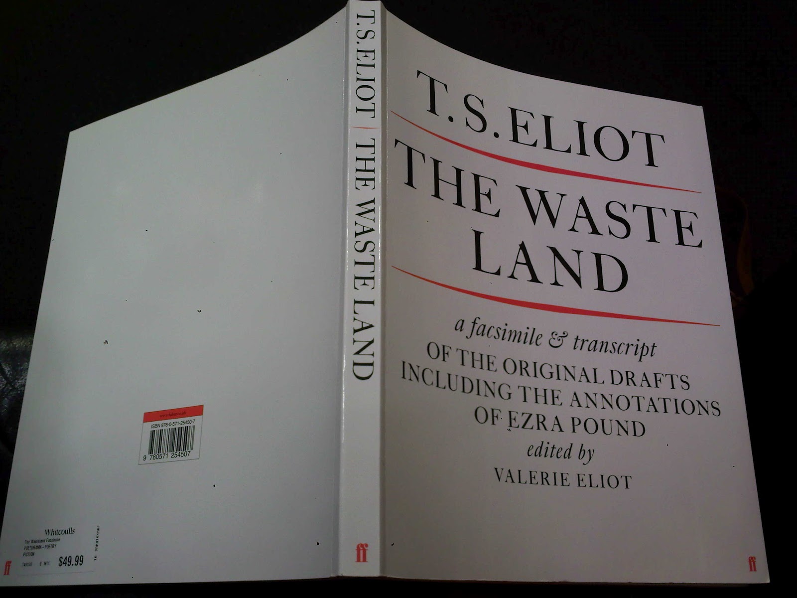
Don't worry, my face isn't a mess. I was just given dirty looks by three different staff members at Whitcoulls yesterday while I took pictures of a book. It's actually an older book than I thought, but it's very pretty and ties in to an app that Faber and Faber released. It is, of course, T. S. Eliot's The Waste Land.
Edited by Eliot's second wife, Valerie, after his death, the book consists of facsimiles and transcripts of his original drafts. The transcripts clearly translate Eliot's incredibly messy handwriting and original comments, as well as comments by Valerie and annotations by Ezra Pound. The cover, as you can see above, is nice and simple but stands out well on the shelf. I was just killing time in the store, but saw this and started taking pictures of it. Here's a close up of the cover.
The cover is so simple and elegant I love it. The red lines make the title stand out even more than it already does, and ties in nicely with the F&F logo. Some may not like the use of all caps for the cover, but I don't mind it. I also love the constant use of a serif font, which is consistent throughout the book.
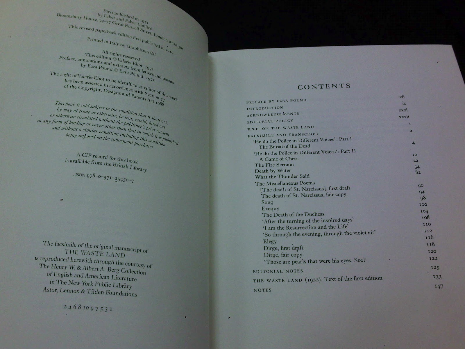
Here are all the prelim pages, starting with half title, other works and title, imprint and contents, and editorial note and quote. All of these pages use the same serif font found on the cover. All of these are super-easy to read, the use of caps, roman and italics are all very appropriate, helping guide the reader to important details.
This is the only picture I took where you can see the page number for the book in the bottom right-hand corner. Now take a look at the picture below. As you can see in the centre top of each page, the page numbers are shown from the original text. The use of square brackets around the actual page numbers help the reader to tell the difference between the two sets of numbers, while keeping the integrity of Eliot's original work.
Also, as you can see, the attention to detail held in each reproduced page is immense. They have thrown lines through at exactly the same angles (check out below for more examples). The editorial note explains that Pound's annotations are in red, Vivien Eliot's (his first wife) are in italics, and the rest of them are Eliot's. The use of colour and formatting to show the different points of view on the text is great for someone studying Eliot's work, or even just an interested reader.
The detail in the reproduced pages is fantastic, I can barely read Eliot's handwriting in most of the pictures, but his wife clearly knew what he was on about.
This one's my favourite. Clearly attacked by Pound, the second to and last paragraphs show red lines crossing through the words just like on the opposite page. Lines come sprouting off, circles surround clumps of words, and once vertical writing becomes easy to read.
This is an excellent book, worthy of anyone's shelf. Plus Eliot had a super interesting life, just take a look for yourself.
More to come, K.
![]() |
| Lookin' pretty swish on the shelf. |
![]() |
| Someone likes three colours. |
![]() |
| Inside flap and half title page. |
![]() |
| Also by and title page. |
![]() |
| Imprint and contents. |
![]() |
| Editorial and quote. |
![]() |
| Inside page. |
![]() |
| Another example. |
The detail in the reproduced pages is fantastic, I can barely read Eliot's handwriting in most of the pictures, but his wife clearly knew what he was on about.
This one's my favourite. Clearly attacked by Pound, the second to and last paragraphs show red lines crossing through the words just like on the opposite page. Lines come sprouting off, circles surround clumps of words, and once vertical writing becomes easy to read.
This is an excellent book, worthy of anyone's shelf. Plus Eliot had a super interesting life, just take a look for yourself.
More to come, K.
Wednesday, 20 June 2012
The Babysitters Club, part one.
Don't worry, this post isn't about the Babysitter's Club, that would just be terrible (I never actually read those books anyway...). I was babysitting for some friends on Saturday night, which was a very uneventful time - their daughters are stunning sleepers! As they are both literary people, they have a library I would be proud to call my own. And in the spirit of the design scrapbook, I waded through them and took photos of a few that caught my eye. Here's my favourite one.
| Steven Hall, The Raw Shark Texts, Canongate, 2007. Click on the images for a better view. |
Apparently the title is a play on 'Rorschach Tests', the inkblot tests. I didn't pick up on it, but Wikipedia told me, so it must be true. The novel takes place in our world with certain aspects that don't exist here, but do in their world, and are hidden by dedicated organisations. If that makes sense... It actually sounds like a really good book. However, I won't lie, the only reason I picked this book of the shelf was because it has review quotes on the spine - something I've never seen before. The main body text on the cover is in a typewriter-like typeface, with the title in a nice large typeface and the all caps helps it stand out. The blue, I feel, ties it back to the shark image (blue = ocean in my mind...) as well as standing out very well against the pale background. The blue is a continuing theme, as you'll see in a few pictures below.
The quotes down the spine are rather interesting - the blue highlighting is around '...The Matrix, Jaws and The Da Vinci Code', which is what this book is apparently the bastard child of. Very intrigued, plus it made me read that section first and then move back up and read the rest of the quotes. Plus, like I've said, I've never seen this before. There are a whole heap more on the inside cover (see next picture), so maybe they're not necessary. This said, it's the thing that caught my eye and made me pick up the book, so it must work.
The image of the shark fin going through both the text on the front and the Canongate logo is great. If you stare at it for long enough it looks like it's actually moving. Also the blots of blood give the book an ominous, 'there's actually going to be a shark' kind of feel. Also, the blurb on the back is simply cut off and doesn't finish anywhere else. Weird, but I feel this may reflect the mysterious nature of the book - the main character wakes up and has no idea who he is or where he is. Intriguing.
As you can see, the designer loves the blue. Which is lucky, 'cause it definitely catches the eye. Also, the reviews given here are just the long versions of the ones on the spine, which kind of takes away from the special-ness of the spine reviews. Sigh. I'm not 100% happy with the white on blue for the reviews though. Although this blue is a repeat feature, the typeface isn't quite heavy enough for me to make me want to read it. Making it slightly heavier, I think, would make it more legible. Any who, the text on the first page is actually a copy of the text on the front cover, and unlike the review quotes, I really enjoy this repetition. Obviously you can't read the text fully on the cover as it's wrecked by the 'ripple' of the water the 'shark' is 'swimming' through, and it's nice to repeat it. I get frustrated if something I want to read or watch isn't repeated.
Here's the front and back inside covers. I really love this, the back is just an upside down repeat of the front. They both start waaaay too high up, and finish with plenty of room at the bottom, or in the back's case, heaps at the top, not so much at the bottom. As it's a repeat, what I've said above about the front applies to the back too.
Now to the text itself. I like what's done, check out the pictures below.
Here are two section markers and the chapters that begin directly after them. Not sure if it's a coincidence, but the two quotes on these section markers are by Jorge Luis Borges and Haruki Murakami. Both of these authors are actually noted in two separate reviews on the inside covers, go on, look up! Maybe the review quotes were picked deliberately for this edition because of that? It seems awfully coincidental... Good work marketing team!
Anyway, to the design! The typeface used is a serif, for section headings, quotes and their authors, chapter headings and body text. I'm pretty happy with all of that. As a novel, a serif is generally considered to be the best choice. As I've mentioned in previous posts, this is due to it's easy-to-read nature. One thing I enjoy about the headings throughout is that there's no bolded text used - it's simply larger for the section numbers and chapter titles. As well as this, they have used italics in a nice and effective way for quotes and the chapter titles. This makes them stand out without throwing them in your face. Also, I'm a big fan of first line indents rather than full breaks between paragraphs, which is what is used in this book.
Now, you're going to see my favourite part of this book, and why the previous photos were so small. Apologies for the mass amount of pictures coming up, but here we go. Might be best to click on the first one and scroll through to the right before checking out what I have to say below.
So as you can tell by the nine photos I've put up that I think this is awesome. I've never seen this done before, and I haven't read the book but from the title I'm sure it's safe for us to assume that the shark (or something similar) is very key to the story. In the second to last picture, so can see the text is repeated and fades out, giving the impression of the narrator drowning (little depressing, I know). This sentence runs on to the next page and the story continues like it wasn't interrupted for 51 (!) pages. As you can tell, I just skimmed through the pages so you readers weren't bogged down with even more photos! This part of the book definitely leaves a lasting impression on me, and I think I might just ask to borrow it I'm time I'm over there.
This is it for this wonderful looking book, more books to come soon.
The quotes down the spine are rather interesting - the blue highlighting is around '...The Matrix, Jaws and The Da Vinci Code', which is what this book is apparently the bastard child of. Very intrigued, plus it made me read that section first and then move back up and read the rest of the quotes. Plus, like I've said, I've never seen this before. There are a whole heap more on the inside cover (see next picture), so maybe they're not necessary. This said, it's the thing that caught my eye and made me pick up the book, so it must work.
The image of the shark fin going through both the text on the front and the Canongate logo is great. If you stare at it for long enough it looks like it's actually moving. Also the blots of blood give the book an ominous, 'there's actually going to be a shark' kind of feel. Also, the blurb on the back is simply cut off and doesn't finish anywhere else. Weird, but I feel this may reflect the mysterious nature of the book - the main character wakes up and has no idea who he is or where he is. Intriguing.
| First page. Apologies for my hand. |
| Front and back inside covers. Again, hand apologies. |
Now to the text itself. I like what's done, check out the pictures below.
![]() |
| Apologies for fingers and smallness - click for bigger version. You'll know why they're so small soon... |
Anyway, to the design! The typeface used is a serif, for section headings, quotes and their authors, chapter headings and body text. I'm pretty happy with all of that. As a novel, a serif is generally considered to be the best choice. As I've mentioned in previous posts, this is due to it's easy-to-read nature. One thing I enjoy about the headings throughout is that there's no bolded text used - it's simply larger for the section numbers and chapter titles. As well as this, they have used italics in a nice and effective way for quotes and the chapter titles. This makes them stand out without throwing them in your face. Also, I'm a big fan of first line indents rather than full breaks between paragraphs, which is what is used in this book.
Now, you're going to see my favourite part of this book, and why the previous photos were so small. Apologies for the mass amount of pictures coming up, but here we go. Might be best to click on the first one and scroll through to the right before checking out what I have to say below.
So as you can tell by the nine photos I've put up that I think this is awesome. I've never seen this done before, and I haven't read the book but from the title I'm sure it's safe for us to assume that the shark (or something similar) is very key to the story. In the second to last picture, so can see the text is repeated and fades out, giving the impression of the narrator drowning (little depressing, I know). This sentence runs on to the next page and the story continues like it wasn't interrupted for 51 (!) pages. As you can tell, I just skimmed through the pages so you readers weren't bogged down with even more photos! This part of the book definitely leaves a lasting impression on me, and I think I might just ask to borrow it I'm time I'm over there.
This is it for this wonderful looking book, more books to come soon.
Subscribe to:
Posts (Atom)