Thursday, 26 July 2012

Book review, the second.


From the original post on the Booksellers blog, book review: The Hungry Heart.
This book is in stores now and is a finalist in the New Zealand Post Book Awards. 

“In winter, the milk freezes in the pantry, and the water in the bedroom.” William Colenso.
As I write this, these words ring a truth for me and others I know – student living, not all it’s cracked up to be.

When Booksellers NZ asked me to review a book from the New Zealand Post Book Awards shortlist, I immediately jumped to the non-fiction –my favourite genre. There I saw The Hungry Heart, and vaguely recognised the name Colenso. Intrigued, I requested, and was given.
Most know William Colenso as the missionary that protested the Treaty of Waitangi (he interrupted Hone Heke as he moved forward to sign), was kicked out of the church for fathering an illegitimate (‘interracial’) son, and for causing controversy when a new high school wanted to be named after him in Napier. In The Hungry Heart, Peter Wells mentions all of these things, while piecing together and creating a truly fascinating and detailed biography of Colenso.
As a publishing student, I was pleasantly surprised to read of Colenso’s added profession as a printer. He hand-set all 356 pages of the 1837 New Testament in Maori, and printed it on a press that required two waka lashed together to reach his house in Paihia – “It must have seemed as momentous as the arrival of the Trojan Horse inside the gates of Troy.” Colenso picked up the Maori language very quickly; this helped him create printed texts for Maori, as well as helping the job he actually came to do, be a missionary.
He also managed to create huge scandals in his life, and found himself in the middle of many confrontations, some verbal, others physical. I don’t want to ruin it for you, but Colenso was all over the place.

The remarkable thing I find about this book is Peter Wells’ ability to bring Colenso back so easily to a modern, and mostly commercial, audience. While reading, Wells involves you in every aspect – as he discovers more, you discover more about Wells’ life and journey to find Colenso, and about Colenso’s life. There are constant uses of ‘let’s’ – “Let’s look a little further…” Wells doesn’t mind reminding you that you’re reading about him writing about Colenso, the subtitle Journeys with William Colenso really does fit. You’re following Wells’ journey to find Colenso, who really was on his own life journey.

In the most basic way I can say it – I thought this book was fantastic. Wells has done an amazing job of research and writing to create it, and for that I thank him.

The one downfall is the physical weight – the book is filled with stunning photography, pictures, letters, all of which are printed on a lovely glossy and heavy paper to make each page stand out. I completely understand the need for this, but when it makes my bag weigh twice as much, I’m less likely to take it as my everyday book.

The book travels through all of Colenso’s life, focusing on his life in New Zealand since this is where he spent the majority of it. This is really the time that defined him; I have no doubt Colenso would agree with that. He had some serious highs and lows throughout his life, but without all of these, would New Zealand still know who William Colenso is today?

The Hungry Heart 
by Peter Wells
Published by Vintage, Random House NZ
ISBN 9781869794743 (Hardback)
ISBN 9781869794750 (Ebook)

Review book supplied by Vintage, Random House via Booksellers NZ.

Tuesday, 10 July 2012

First book review, oh the excitement.


A while ago I volunteered to start reviewing books for Booksellers NZ. My first assignment, you ask? Black Tide. Oh yes.  Here it is, and here’s the link to the original post by Booksellers.

I don’t think it’s a huge assumption to think everyone knows what the Rena oil disaster is; if not, there’s a chance you've been out of the country and not up to date with current events or you live under a rock.

Described as New Zealand’s worst maritime environmental disaster, the spill was caused by the grounding of MV Rena on the Astrolabe Reef off the coast of Tauranga on 5 October 2011. Black Tide: The Story Behind the Rena Disaster by John Julian tells of the ship’s history, the wreck, the first five days, and carries on through to explaining the city of Tauranga and the future of Rena.

Black Tide is an easy-flowing book and easy to read too; the writing style of John Julian creates a simple story that is straightforward to follow and understand. The two sections for photos are great quality and add to the story.

Julian goes in to great detail about the Rena and the surrounding disaster, it is clear he knows his stuff. He explains the history of the ship, built in 1990 and known as Zim America; each chapter begins with a quote, some directly in reference to Rena, others from difference sources and times but still on the topic.

My favourite is at the start of chapter six, The Reef (p.119): ‘It was the Law of the Sea they said. Civilisation ends at the waterline. Beyond that, we all enter the food chain, and not always right at the top.’ Hunter S. Thompson. Julian also gives decent histories at the beginning of chapters before launching in to the disaster itself. For example, a history of oil spills is given (p72). This attention to detail is great; he reflects on these spills while explaining elements of Rena too. However, I can’t help but get some impression of fleshing out. At 208 pages, Black Tide isn’t particularly long or short, but it did come out rather quickly.

Black Tide was released April 2012, after the ship split in half but before it stopped being a major issue for New Zealand (which is clearly still is). Over the first few months, the news was dominated with the event; slowly it’s been edging away from main news. However, the cost to taxpayers was just a headline around the country ($35mill), as well as the captain and navigation officer being jailed for seven months. By waiting for a few more months, these elements could have been included in, instead of attracting the feeling of a rush job to be the first book on the subject.

There were also a few minor mistakes in the texts, my favourite being on page 27, ‘…Prime Minister John , then transport…”. Not sure how ‘Key’ was missed out, considering the space isn’t quite big enough to write it in either.

The Rena disaster is no doubt a dark time for our environment. Although the book has the main points and looks deep into the disaster, instead of being mostly information one could find on the internet, I really feel that Black Tide could have benefited greatly by waiting for more of the story before being published.

Review book supplied by Hachette via Booksellers NZ.
Black Tide: The Story Behind the Rena Disaster by John Julian
Published by Hodder Moa
ISBN 9781869712709

Monday, 9 July 2012

The end's not near, it's here.

Yes, the end is here. Thanks to Band of Horses for the title. And I think I've saved the best to last, well what I think is super pretty. 
This is for You by Rob Ryan was published in 2007, and when it first came out I pleaded with my sister, working at vicbooks at the time, to buy it for me. Being the loving sister, she did. And it is beautiful. Here's a picture of the dust jacket and book itself. The book explores themes of love and loneliness, and the prominent colours on the covers help to emphasis this. The thing that first caught my eye with this book with the bright red pinned against a very white background. As well as this, the cut-out nature of the book intrigued me. As did the endorsement by Sophie Dahl; the same cut-out lettering has been used for the endorsement, and she's pretty awesome - writing and modelling and stuff. The continuation of the red to the back cover is also a nice way to continue a theme. 
Before you ask, no I did not take this picture upside-down. When you take the dust jacket off, this is how the book looks - upside-down. I don't know if mine's an awkward dud or if this is how it's supposed to be - I've never seen another copy. But anyway, the red theme has continued through from the dust jacket, which makes me happy - red is the colour of love, people, and that's what this book is all about. If I saw this book on the shelf, without it's jacket, I'd still pick it up. The simplicity of the cover alone is enough to intrigue me, plus the bell on the front is pretty cute.

To the inside! Well almost the inside, to the end papers and dust jacket flaps! I'm a very sentimental person, and a bit of a hopeless romantic, so the first thing I saw when opening the book was the left-hand flap here. I love it. The typeface is the same as the cover - a handmade sans-serif that's actually pretty easy to read when you take the time. This isn't a book to rush through, the pages can be confusing, as you'll see soon. The endpapers are beautiful too, it's the first time I've seen ones that incorporate the actual title of the book into the pattern. 


As an illustrated book, there are no page numbers, which is nice. Each page does stick to a frame, as you'll see in later pictures. Ryan sticks to the margins, probably so no picture is wrecked if the cutting goes wrong. The green of this page stands out wonderfully, like the red, against the white stock. The green also tied in nicely to the leaves in this spread, as the man walks and thinks. The text is in the same all caps as the cover and flaps, enforcing his walking and thinking and making it super easy to read. So simple, and so lovely. 


This is probably the hardest spread in the book to read. The pages mirror each other, as a son and mother talk. The colours compliment each other, while reflecting the gender of each character. The typeface is still the cutout style and a sans-serif, however it's in lowercase and much harder to read. This comes back to this being a book you read because you want to know what it has to say. It may make you work hard, but it's worth it.
Here's another full page spread. You can even see the stitches for the binding - still good quality. This has the easy-to-read all caps sans-serif, and really is just a beautiful page. You can see in this spread, and the previous one, the way Ryan does keep inside the invisible margins. By being consistent, it helps the reader to become familiar (to a basic level) with how each page will be laid out. I also like they way 'that' is stretched out over the two pages, there's no effort on his cutting to cram it or unbalance the heart.


I just wanted to throw this spread in because it shows the theme of loneliness that's explored with love through the book. The first time I looked at it, I read 'I am not alone' but missed the 'And I wrote and wrote'. Ryan's ability to create a stunning piece of visual art that acts as great narrative too. This is one of the pages that you can actually see that the images are Ryan's cutout pieces of paper - bottom right-hand corner. Not sure if it's intentional, but it adds to this spread, since he tells the reader nothing's gonna happen until you start, and he started cutting and clearly never stopped. He has a store even!


Last spread I promise! It's the last pages of the book, so it kinda has to be anyway... I love that he's kept the fun cut-out for the dedication, while switching to a more traditional sans-serif for the imprint. It makes it super easier to read, and this is important information for some people. As with most illustrated books, the imprint appears at the back of the book. It doesn't disrupt the flow of the book, and since most people reading this book won't actually need to know this information, it makes the most sense.
I see new things in This is for You every time I look at it, which is exactly what a good book should offer - continuous learning.


Man, this post has the best design ever! So proud of myself, it's only taken a few posts to get the hang of blogspot... But anyway, that's it from me about book design, my scrapbook is due in today. Unless something looks super awesome, then maybe I'll share it with you.


Until next time,
K.

Sunday, 8 July 2012

One Day More.

How good is that? The title of this post has a double meaning - there's one more day left until my assignment is due, and it's the name of a fantastic song from the greatest musical ever. Yes people, Les Miserables. It's not secret that I love it. So much. My sister and I saw it in 2010 on the West End, and below you will see pictures from the booklet created for the 25th anniversary year of the show.
Here's the cover spread to the booklet. It's a simple stapled booklet, all printed on a nice glossy stock. The cover uses the well-known symbol of Les Mis, the illustration of Cosette by Ã‰mile Bayard. The typeface for the title and other text is one I think was created for the show - it's become the expected sight for Les Mis. The colours of the cover catch the eye, however I'm sure you'll be buying this more because of the content than the cover. The back image is taken from the show - Enjolras waving his French flag during the battle at the barricade (see, told you I love it). As this is for the 25th anniversary, the text at the top in yellow stands out and catches the eye against the smoky-white background. 
Here we have the first pages when you open the booklet, apologies for the glare on the left. The typeface for the title is the same as the front, as is the names of everyone on the left - they're also in all caps. This helps to distinguish the names from their roles for the reader, as well as just making it easy to read. The roles of people are in italics, and in a different, very basic sans-serif. This is surprising given the amount of text on the right side here, and in the pictures below. I do like the use of a column for the text, it doesn't take away from the images and the page, but is still prominent enough as it should be. The white typeface works well on these dark pictures, and it continues throughout without being an issue. The use of the red banner in the background gives stunning colour to the page, while tying it back to the image of Enjolras dead on the barricade. Sad. 
The top says 'Victor Hugo - France's Favourite Son'. So what better picture to accompany him than that of the 'Lovely Ladies' (prostitutes), and Fantine on her deathbed with Valjean. The top picture of those lovely ladies does look fantastic, the red/pink colour comes from the lighting in the show, but beautifully catches the eye. However, my favourite part about this spread is the end of the text on the right. The picture of Valjean and Fantine stretches behind Hugo's life story, which is in columns with a ragged-right edge. But the last column of text has had it's ragged-right adjusted to fit around the two figures, and not covering them up at all. The curved edge catches the eye, and makes the text easier to follow for the reader without affecting the picture. 
I just really loved this image. This is the cast I had the pleasure of seeing (with an incredible understudy for Valjean), and my, it was amazing. I was crying right from the get-go. But to this page. This is one of the only pages I have in the scrapbook that's just an  image spread. The serif typeface in the top left-hand is beautifully simplistic, coming from the song One Day More just before half time. The typeface gives the impression of a song lyric, flowing, easy to read, and a bold statement. All this while the picture underneath gets has some fantastic, uplifting light coming in from the right, and everyone looks amazingly photogenic while still singing. Gee whizz. As I said earlier, I'm sure you'll be picking this booklet up because you know the musical, and this page has a powerful message behind it, if you know what you're looking at.
Last page, and last picture I'll look at from this. Top left corner, another fantastic image with my favourite line in the musical - 'To love another person is to see the face of God'. I'm not religious, in the slightest, but in the context of the musical, and when you see Alfie Boe's face when he sings the line, my heart just melts. But the issue I have with this image and text is the last few words get a bit lost in the white of Cosette and Fantine's white dresses. It's nice that the designer kept the white typeface consistent, but this part lets it down. As for the rest, every image in number with a small white number in the left-hand corner of each picture. These numbers have a corresponding caption at the bottom left-hand side. This page is to acknowledge the past, present, and international productions of Les Mis, which is what each of these pictures show. This spread is busy, however I think the designer has managed to make it work. The reader can still follow it, and if you really want to know what a particular picture it is, it is easily searchable.


I think we can all safely assume I love Les Mis. Apologies for the rant, but it's just so good.


The end is almost here!
K.

Friday, 6 July 2012

Last pages geek-out.

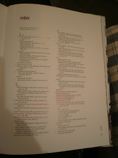
As I mentioned in the last post, I quite enjoy the last pages in non-fiction books - that is the bibliography, index, glossary, etc. I am awesome. When I finished my degree, I got rid of most of my textbooks, but luckily my boyfriend's still got a couple. (already featured on the blog.)

Glossary.
So here we have examples of the back pages from Communication and New Media. Starting here with the glossary. The heading GLOSSARY and the heading of each term uses a simple sans-serif typeface, that looks like it's been bolded. The text book is in a serif, which is the easiest for a reader to follow. The margins on the page are large, which draws the readers attention to the information in the text block. Very basic, easy to follow.
Bibliography.

As these are the same book, the page layouts are all the same. Using APA style, the bibliography is easy to follow for those people that actually need to look at it. The same serif and sans-serif are used for the body text and headings. 


Index.
To the index! Again, same typefaces as above. Each letter isn't marked, but there is a full line space between the end of one and start of the next, making it super easy for the reader to follow. Where there are more headings under a larger heading, for example 'advertising', a five-character indent is used to show the difference between the two. This is also used when the main entry is longer than one column width. The use of column helps guide the reader's eyes down the page, and creates a page that doesn't look cramped. The information given is important, and it needs to be legible.


And to psychology!


Here's the glossary from Psychology 7/e. The margins are nice and large, creating a nice spacious page. The title is a good distance from the top of the page, helping the reader to know where to start. The word in the glossary is in bold, with the definition starting a small indent in to the right. Again, this is helping the reader to easily find words, and read the definitions. The page number in the bottom right has corner is B1, which helps to distinguish between the main body text, and the bibliography sections. The following two pictures are a part of this B page section as well.


Being a fancy textbook, and rather large too, this book has a name index. The title starts at the same place as the glossary, keeping things consistent. The names are listed alphabetically by last name, followed by the every page number that that name appears on. There's a small line at the top, in the same size typeface as the rest of the page, which explains the finer points.
Here's the subject index of the book. It's very similar to the index in the media book above. If a main heading has subheadings underneath, they are indented by around five characters to help the reader distinguish the difference. Like the name index, the page has the small text at the top to help the reader understand what each number and their certain formatting means. 


Almost done!
K.


The Babysitters Club, part two.

Here in New Zealand we have an obsession, and that's with cookbooks. I don't know why, but we do.  While babysitting I took note of a couple, including one by my favourite, Jamie Oliver. You may think Nigella is my favourite, given my post about her, but I love Jamie, he's just wonderful.
Michael Joseph, 2000
Following the success of his first book, The Return of the Naked Chef was published to accompany the BBC series The Naked Chef. Look at that grin on the front! That's what sells these books, Oliver's insane passion for his work and that he's the son every mother wants. The spaced, uncrowded cover design makes it a pleasure to look at. Oliver's yellow top and grin catch the eye easily, and the giant JAMIE OLIVER will make you look at this because, let's face it, he's great.
Title page, dedication
Imprint, contents, introduction
I think my favourite thing about this book is that no page is wasted. No doubt this book would have been expensive to produce, but since the sales would've been fantastic, no cost is too high for Jamie. A nice, simple, and spaced sans-serif is used consistently throughout the book. As a beautifully illustrated book, it makes sense to use the spread to show the picture of Jamie cooking in all his glory for the title page - it brings it home that it's all about him and his cooking just by turning to the first few pages. It's well acknowledged by Jamie that he has Jules, his wife, in his life - he never hides the fact, which I'm sure wasn't the BBC's idea. The dedication to her is simple and lovely, I let out a little 'aww' when I first saw it. The red of the typeface is repeated throughout the book, and as the first instance, I like to think it shows his love nicely. The imprint is simple and traditional - using a serif, and not trying to be something it's not. The contents uses the same colour from the dedication, as does the introduction coupled with a lovely picture of the man himself again. The introduction is very 'Jamie', and as the text goes right to the ends of the page I can imagine there were some issues with the cutting of the book at the printer. I love the simpleness of the contents page - very basic, spacious, and super easy to read. The designer didn't feel the need to fill the whole page with useless information, which is much appreciated since I find cooking books can be daunting.
Section markers
Here are two examples of section markers, which are listed on the contents page. Each of the section markers are a double-page spread in black and white. The marker on the left, fish and shellfish, shows Joe, Jamie's regular person at the market. The homeliness of this picture brings the book back to Jamie and lets the reader in to his life. The typeface is the same sans-serif, with Joe's name in the same red as before, and the section title changes colour from black to white depending on the most appropriate one. This is a great choice, changing it if need be, as I've already said in a previous post, it can be a disaster for the reader to stick to one colour. 
Instead of looking at the obvious recipe for the last picture, I though I'd look at the actual last pages of the book, or at least the index right now. The margins around the text block are traditional in sizes, giving the reader plenty of room to hold the book open when need be. The bottom right-hand side has a nice running header and page number, and due to the margin it's easy to locate this. The list of recipes are easily formatted with the main ingredients in the same red, and recipe titles in black. The page numbers in roman are the recipes themselves, while the bold ones indicate illustrations; a v on the left-hand side offer vegetarian recipes. I really like the last pages of books - I love non-fiction as a genre, and would like to learn more about bibliographies and indexes. Yes, I am that cool.
Almost done for the scrapbook, look forward to it!
K.

Wednesday, 4 July 2012

Amazon, you ol' dog you.

I've said it once, I'll say it again - I don't particularly care for ebooks. Due to my lack of one, and lack of being organised in the slightest, all of the following pictures have been borrowed from the internet and the caption will send you to the original link. 
I'm going to look at the Kindle, I've got pictures from the touchscreen, keypad, and the other one that's not either of those two. I'm not looking at the Fire, as I just want to focus on the ink display. Kindle, as we know, was created by Amazon, who is taking over the world. I don't want to get in to it, mainly because I'm super tired but also because that's not what I'm here to talk about. Instead, design. Let's start with a cover. Naturally.

Left - http://bit.ly/O3euGx; right - http://bit.ly/R8Y56P
Here we have One Summer, published in 2011 by Grand Central Publishing. However, on the left, the 6" E Ink display Kindle, retailing for $109.00 on amazon.com right now. On the right, a book, or at least the cover of a real book, most likely hardback. The colours in the cover are fantastic, the subtle tones of summer make you want to pick up this book and find out what this one summer was all about. The author's name is first, due to the fact he's established and written enough novels to have his name known. The typeface is a classic serif, making him look even more important. The typeface for the title feels nice and flowy, giving the impression this book's going to be full of fun and drama. But to the Kindle. My main issue with the Kindle is there's no ink technology to make the screen colour yet. Maybe you look in to every ebook you purchase, but with this one, I wouldn't buy it based on the cover on a Kindle. Does that makes sense? Anyway, I've been told Kindle's don't automatically go to the cover on an ebook, you have to choose to. I buy books because I love the physical object with a pretty cover you can hold - ebooks just don't appeal. 
To the body text!
The Paris Wife prologue. http://bit.ly/O3euGx
Here's a sample page on the same Kindle as above. The original printed page looks the same as this - same typeface, same capital T, and roughly the same space between PROLOGUE and the beginning of the body copy. The typeface is a nice serif, easy to read and attractive looking. The margins around the text is also great, a nice amount of space so the page doesn't look or feel cramped while reading alone. I assume this is probably the preset size typeface, since it's easy to change the size on a Kindle, as you can see. 
http://amzn.to/MT9doe
Apologies, this isn't from the same book.
You can even sneakily choose a sans-serif typeface - blasphemy! This is one cool feature I'll give the Kindle. I know when I get tired or my eyes are just feeling lazy for no reason, I'd love to be able to make the typeface of my book bigger. The other great thing about this feature is that it opens it up to a whole other market of readers, older people. I mean no offence when saying this, but it's true! I've heard people buying ereaders for parents and grandparents so they don't lose reading. I'm aware that libraries often stock large print books, I'm just not sure how much of a market there still is for this. 
One more picture, and it's pretty awesome. 
http://bit.ly/dNFLaW
At least I think it's awesome. I'm not a huge fan of manga or graphic novels, but I've dabbled. You can purchase graphic novels and manga for Kindle, but this one I've found was using a programme called Mangle. I think it's come out great considering it's not made for the reader. The images have come out really well, although I'm sure it would look better in colour. They're really clear and easy to read, which is probably due to the converter too. The only issue is the pages don't totally cover the whole screen, so they overlap a bit like on the right hand side. Because you can adjust the typeface size and manga is in panels, it wouldn't be too difficult to create a setting that's perfect for this genre. This is the Kindle keyboard with 3G and wifi, which is currently $189.00 on Amazon. They're managing to do pretty well for themselves, are Amazon.


A few more to come,
K.

Sunday, 1 July 2012

Typeface fails.

It's not secret that I love The Beatles. Everyone that knows me know this small fact about me. It's also not a huge secret that I really do enjoy Shakespeare, Twelfth Night's easily my favourite. However, I don't particularly care for Paul McCartney (George all the way), and a book of Shakespeare's play my mum picked up is just slightly terrible. We'll start with Paul.
Howard Sounes, HarperCollins, 2010
Fab: An Intimate Life of Paul McCartney is the most comprehensive biography of McCartney around. Released in 2010, it covers his early life in Liverpool, The Beatles, Linda, Wings, Lennon's death, and of course the Heather Mills saga. McCartney's life has been filled with tragedy and success, and at a lovely 634 pages, this book seriously covers it all. This cover incorporates most of McCartney's life in a simple and attractive way. Musical instruments, a pedestrian crossing and bright colours surround a very honest picture of the name himself. Looking his age, there's no attempt to hide the fact he's getting on with life, no matter how many up and downs he's thrown. The name alone would attract people towards this book on the shelf, and the cover design just enhances the want of a reader to have it on their shelf. That's the reason I bought it, I'm intrigued by Paul's life, but he's definitely third equal for my favourite Beatle. The typeface is a basic sans-serif, with McCartney's handwriting used for his name. The sans-serif works on the cover, it's nice and easy to read making it attractive for readers. Just wait until you see inside...
Inside cover, half title page, 'also by', and title page.
Imprint, contents, contents cont., and first section marker.
Here're the prelim pages for Fab. The red inside cover repeats from the thin red border on the cover design. The typeface is a sans-serif also continued from the cover, the use of white mimics the paper which I really like - it stands out well on the dark red and it's easy to read. Throughout these pages, the only change in typeface comes from 'HarperCollinsPublishers'  on the title page, and the use of a typewriter-like typeface for the contents - this continues through the book for each section title, chapter title, and A headings within chapters. These pages are all easy to read, however using a sans-serif for the imprint is something I haven't seen in non-fiction before. I understand that it's just the typeface they're using and the designer is being consistent, but for important information a serif would be much more suitable.
Now this is where the book gets really interesting. As you can see on the right here, a nice 1 is in a circle (a continuing theme), the chapter title and A heading are in the same typeface as the title, as is the B heading in the second picture (The Quarry Men). Each of these elements are great, easy to read and distinguished for the reader to follow along. But the body text, oh the body text. It's in the same sans-serif as the prelim pages. Terrible. A serif is usually used for books with a narrative, and as a long biography, you'd think they'd have used one! This sans-serif is still easy enough to read, the characters are spaced and each page is justified. The main thing that's put me off reading this book if because I'm not used to it, and I find it a bit unsettling. Perhaps others didn't mind, but I think there's a time and a place for sans-serif fonts, and a long narrative story isn't one of them.

Usborne, 2006, illustrations by Elena Temporin.

Now to Shakespeare.
This is Stories from Shakespeare, the book takes 10 of his stories and re-writes them in to 'a lively, easy-to-read style', according to the blurb. I believe Mum picked this up at a second-hand store because that's just what she does sometimes. Dad started flicking through it and promptly gave up, for reasons you will see in a minute. Firstly, this cover. I do like it. It's bright enough to catch attention, without making the three witches from Macbeth look too exciting or happy. The typeface for the title and Usborne on the spine, as well as bring shiny and silver, gives a modern but still traditional feel to the book. The blurb uses a slightly-serif typeface, that links to the traditional feel that the title gives.
Imprint, title page, and contents.
The brightly blue background of the imprint and title page spread catches the eye very easily, and the typefaces of the title have come through from the cover. The typeface of the imprint, illustrator etc., is the typeface that is continued throughout the book, including the contents page. Each of these pages are designed beautifully, they're easy to read, and hold the attention of the reader well. However, now you will see why Dad put it down so abruptly.
Oh Macbeth, you're not hard to read. The black, slightly-serif typeface stands out easily against this yellow-cream background. You can see where the heading is, and where printers' flowers have been inserted to indicate a break. This is all well and good, but then the next picture tells all.
BAM. I can understanding wanting to be consistent with one colour for the text, but where the background is darker, you can hardly read the text. This was one of the issues Dad had when going through this book, and his other was actually the size of the text - apparently it's too small. I can read it, and kids probably can, but I can understand the difficulty. So back to the colours, I've mentioned before it's pretty OK to change the typeface colour if the illustrations call for it. The whole things makes me pretty angry, it looks ugly and, just like Dad, it'll turn people of even reading the book. Silly choice Usborne.


More to come, 
K.