Here in New Zealand we have an obsession, and that's with cookbooks. I don't know why, but we do. While babysitting I took note of a couple, including one by my favourite, Jamie Oliver. You may think Nigella is my favourite, given my post about her, but I love Jamie, he's just wonderful.
 |
| Michael Joseph, 2000 |
Following the success of his first book, The Return of the Naked Chef was published to accompany the BBC series The Naked Chef. Look at that grin on the front! That's what sells these books, Oliver's insane passion for his work and that he's the son every mother wants. The spaced, uncrowded cover design makes it a pleasure to look at. Oliver's yellow top and grin catch the eye easily, and the giant JAMIE OLIVER will make you look at this because, let's face it, he's great.
 |
| Title page, dedication |
 |
| Imprint, contents, introduction |
I think my favourite thing about this book is that no page is wasted. No doubt this book would have been expensive to produce, but since the sales would've been fantastic, no cost is too high for Jamie. A nice, simple, and spaced sans-serif is used consistently throughout the book. As a beautifully illustrated book, it makes sense to use the spread to show the picture of Jamie cooking in all his glory for the title page - it brings it home that it's all about him and his cooking just by turning to the first few pages. It's well acknowledged by Jamie that he has Jules, his wife, in his life - he never hides the fact, which I'm sure wasn't the BBC's idea. The dedication to her is simple and lovely, I let out a little 'aww' when I first saw it. The red of the typeface is repeated throughout the book, and as the first instance, I like to think it shows his love nicely. The imprint is simple and traditional - using a serif, and not trying to be something it's not. The contents uses the same colour from the dedication, as does the introduction coupled with a lovely picture of the man himself again. The introduction is very 'Jamie', and as the text goes right to the ends of the page I can imagine there were some issues with the cutting of the book at the printer. I love the simpleness of the contents page - very basic, spacious, and super easy to read. The designer didn't feel the need to fill the whole page with useless information, which is much appreciated since I find cooking books can be daunting.
 |
| Section markers |
Here are two examples of section markers, which are listed on the contents page. Each of the section markers are a double-page spread in black and white. The marker on the left, fish and shellfish, shows Joe, Jamie's regular person at the market. The homeliness of this picture brings the book back to Jamie and lets the reader in to his life. The typeface is the same sans-serif, with Joe's name in the same red as before, and the section title changes colour from black to white depending on the most appropriate one. This is a great choice, changing it if need be, as I've already said in a previous post, it can be a disaster for the reader to stick to one colour.
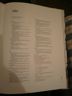
Instead of looking at the obvious recipe for the last picture, I though I'd look at the actual last pages of the book, or at least the index right now. The margins around the text block are traditional in sizes, giving the reader plenty of room to hold the book open when need be. The bottom right-hand side has a nice running header and page number, and due to the margin it's easy to locate this. The list of recipes are easily formatted with the main ingredients in the same red, and recipe titles in black. The page numbers in roman are the recipes themselves, while the bold ones indicate illustrations; a v on the left-hand side offer vegetarian recipes. I really like the last pages of books - I love non-fiction as a genre, and would like to learn more about bibliographies and indexes. Yes, I am that cool.
Almost done for the scrapbook, look forward to it!
K.


