Wednesday, 27 June 2012

Rebel, Rebel.

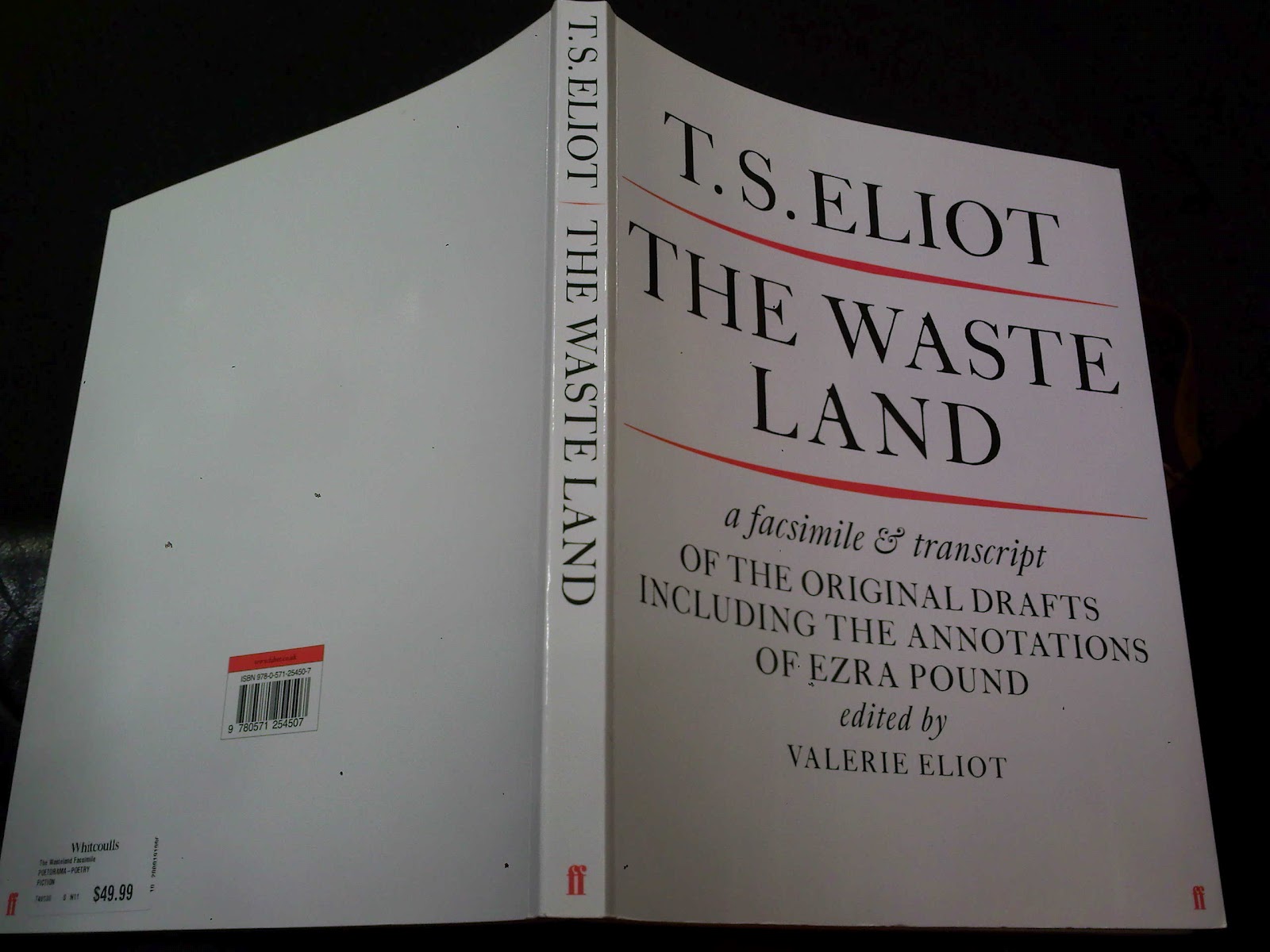
Don't worry, my face isn't a mess. I was just given dirty looks by three different staff members at Whitcoulls yesterday while I took pictures of a book. It's actually an older book than I thought, but it's very pretty and ties in to an app that Faber and Faber released. It is, of course, T. S. Eliot's The Waste Land. 
Lookin' pretty swish on the shelf.
Edited by Eliot's second wife, Valerie, after his death, the book consists of facsimiles and transcripts of his original drafts. The transcripts clearly translate Eliot's incredibly messy handwriting and original comments, as well as comments by Valerie and annotations by Ezra Pound. The cover, as you can see above, is nice and simple but stands out well on the shelf. I was just killing time in the store, but saw this and started taking pictures of it. Here's a close up of the cover.
Someone likes three colours.
The cover is so simple and elegant I love it. The red lines make the title stand out even more than it already does, and ties in nicely with the F&F logo. Some may not like the use of all caps for the cover, but I don't mind it. I also love the constant use of a serif font, which is consistent throughout the book.
Inside flap and half title page.
Also by and title page.
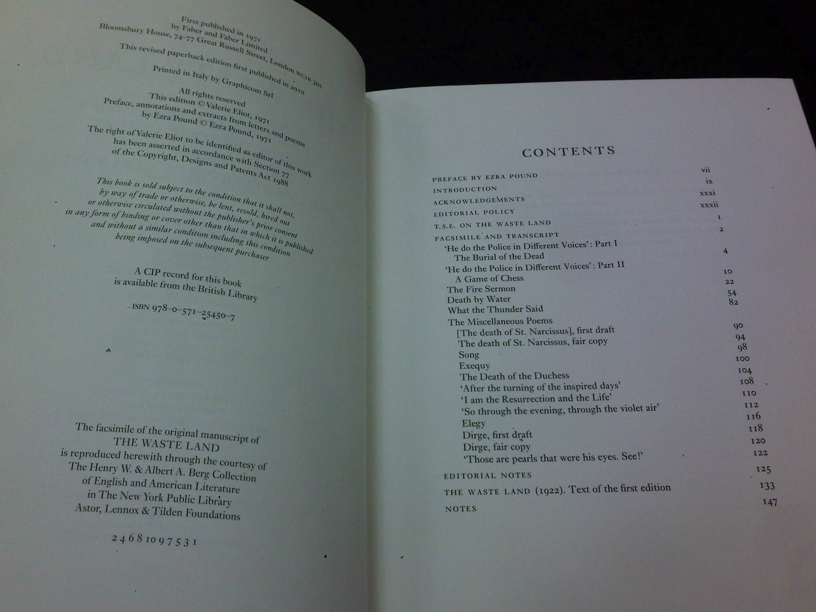
Imprint and contents.
Editorial and quote.
Here are all the prelim pages, starting with half title, other works and title, imprint and contents, and editorial note and quote. All of these pages use the same serif font found on the cover. All of these are super-easy to read, the use of caps, roman and italics are all very appropriate, helping guide the reader to important details.
Inside page.
This is the only picture I took where you can see the page number for the book in the bottom right-hand corner. Now take a look at the picture below. As you can see in the centre top of each page, the page numbers are shown from the original text. The use of square brackets around the actual page numbers help the reader to tell the difference between the two sets of numbers, while keeping the integrity of Eliot's original work.
Another example.
Also, as you can see, the attention to detail held in each reproduced page is immense. They have thrown lines through at exactly the same angles (check out below for more examples). The editorial note explains that Pound's annotations are in red, Vivien Eliot's (his first wife) are in italics, and the rest of them are Eliot's. The use of colour and formatting to show the different points of view on the text is great for someone studying Eliot's work, or even just an interested reader.
The detail in the reproduced pages is fantastic, I can barely read Eliot's handwriting in most of the pictures, but his wife clearly knew what he was on about. 
This one's my favourite. Clearly attacked by Pound, the second to and last paragraphs show red lines crossing through the words just like on the opposite page. Lines come sprouting off, circles surround clumps of words, and once vertical writing becomes easy to read.


This is an excellent book, worthy of anyone's shelf. Plus Eliot had a super interesting life, just take a look for yourself.


More to come, K.


Tuesday, 26 June 2012

I don't like...

Mondays, do you ask? No, well, not always. Spiders? Yes. So much yes. Ew. But what I really don't like is the book design I'm going to talk about now. Yes, I'm talking about flippin' flipback books. 

Four titles out of 18. Thanks to vicbooks Pipitea for the books. Apologies for all the photos,
they're not great.

Originally designed in the Netherlands, the flipback book opens vertically with the pages turning from bottom to top. According the flipback website '...you get a full length novel in little more than the size of a smartphone.' They're actually 12cm by 8cm, and around 1.5cm - they've managed to keep them all around the same width despite the differing lengths of the original texts. On average, they weigh less than 145 grams and are printed on a very light and thin, almost Bible-paper paper. You'll see some shots further down of the insides.

So above are the spines of four of the titles I've picked out - Misery, Pride and Prejudice, Cloud Atlas and Tinker Tailor Soldier Spy. I've got close ups of Misery and Cloud Atlas further down this post. From first glance, these books look nice. The titles stand out well in a basic san-serif, and a different colour for title and author. The colour of the title actually ties in to the cover image, which you'll see in the next picture.

Covers, looking all pretty. The publisher on the cover alternates between Hodder, Sceptre
and John Murray. I assume this is depending on which imprint currently holds rights?
So here are the covers of the four. They're all covers I've seen before, with the exception of P&P. And I don't really like it at all - there are many, many covers of Austen's novel and it seems odd to pick one so plain compared to the others. I mean, flowers are fine but they're not on the same level as the typewriter for Misery. Or at least that's what I think. The other three are great though, the cover and spines link together nicely and below you'll see Cloud Atlas open fully.
Look how nice and pink it is!
I'm not 100% sure, but I think this cover is an adapted version of the original - someone correct me if I'm wrong! I love it though. The colours stand out, contrasting the pink and blue works so well.The title has an awesome pattern running through it. I'm also really enjoying how short the blurb is, however I'm not enjoying it as a whole. We had a session on blurb writing, and this one screams 'no' to me now. Back in the day I wouldn't have minded, but now I can't allow the author's name to be used to describe the book - a book shouldn't need it's author's name to describe it! Also, as you might be able to see, it's $27.99. Not exactly cheap when the paperback of this book is only $28.99. I guess the convenience the size?
I just realised I didn't get a picture of this, but thanks to the internet I can explain what I'm talking about! Check out the picture below.
Check out the cover and spine... Ooo!
Ooo indeed! As you can (hopefully) see, the spine and front cover aren't attached. The text block is stuck on to the back cover, but not to the spine or front cover. This is so the book holds itself open more easily than you having to push down on the pages of a hardback to make it stay open by itself. This is quite a cool design; my only issue with it is  the wear and tear of it all. When these first came in to the shop, I picked it up and flicked it open and the thing nearly fell out of my hand. If you were to accidently pick it up by the front cover alone, you run the risk that the back starts to rip off. Maybe I'm just rough with my books... I just don't think this will survive in your bag like a usual book would. 

Now for some internal shots, I'm just going to put a few from Misery below. 

Praise the glory!
In case you didn't know.
Start of a chapter.
Example of typewriter text in the novel.
Buy all the flipbacks!
So there you have it, an entire flipback in five images. One thing I have to say straight of the bat, and I hope you noticed it to - the typeface. It's all sans-serif. Urgh. Now, earlier I said I liked it for the cover title, and that still stands. And if you've read my other posts, you'll know that I like sans-serif for kid's books. But not for an entire novel. And especially not for a tiny little format like this. I'm getting worked up just writing this! We discussed in class the main reason a serif font is used over sans-serif for narrative, and that's because there are more points of difference between characters. When you're writing something, your 'a's and 'd's can get mixed up, because generally the only thing showing the difference between this is the vertical line on a 'd'. But with serif, the a comes out like this one does, and you can easily tell that it's an a and not a d. Now the most frustrating thing is that the font I'm using right now, trebuchet, isn't a serif, but Times New Roman is. See the difference? I hope so. Anywho, I hate the flipback for using this. Especially with the typewriter text (second to last image). Doesn't that look shocking? Every 'n' looks like it's italicised, even though I don't think it's supposed to be. Gah. Just dislike on so many levels. Also, the typewriter sections are ragged right, while the rest is justified. Make up your mind people!
Another thing to note is the margin sizes. As a woman, I have hilariously manly thumbs, as a good friend told me when we were 13. Holding the book open on the side with one hand actually isn't that easy, and it definitely gets in my way when reading. I'm fairly certain that the left side is slightly larger, have a look in the 'about the author' picture above. But I'm right-handed anyway, so that's not helpful. 


That's my rant about flipbacks. I really just don't like them, I think the design is just a little crazy and although people went nuts for them when they first came out, the novelty has definitely worn off.


More to come,
K.

Wednesday, 20 June 2012

The Babysitters Club, part one.

Don't worry, this post isn't about the Babysitter's Club, that would just be terrible (I never actually read those books anyway...). I was babysitting for some friends on Saturday night, which was a very uneventful time - their daughters are stunning sleepers! As they are both literary people, they have a library I would be proud to call my own. And in the spirit of the design scrapbook, I waded through them and took photos of a few that caught my eye. Here's my favourite one.
Steven Hall, The Raw Shark Texts, Canongate, 2007.
Click on the images for a better view. 
Apparently the title is a play on 'Rorschach Tests', the inkblot tests. I didn't pick up on it, but Wikipedia told me, so it must be true. The novel takes place in our world with certain aspects that don't exist here, but do in their world, and are hidden by dedicated organisations. If that makes sense... It actually sounds like a really good book. However, I won't lie, the only reason I picked this book of the shelf was because it has review quotes on the spine - something I've never seen before. The main body text on the cover is in a typewriter-like typeface, with the title in a nice large typeface and the all caps helps it stand out. The blue, I feel, ties it back to the shark image (blue = ocean in my mind...) as well as standing out very well against the pale background. The blue is a continuing theme, as you'll see in a few pictures below. 
The quotes down the spine are rather interesting - the blue highlighting is around '...The Matrix, Jaws and The Da Vinci Code', which is what this book is apparently the bastard child of. Very intrigued, plus it made me read that section first and then move back up and read the rest of the quotes. Plus, like I've said, I've never seen this before. There are a whole heap more on the inside cover (see next picture), so maybe they're not necessary. This said, it's the thing that caught my eye and made me pick up the book, so it must work.
The image of the shark fin going through both the text on the front and the Canongate logo is great. If you stare at it for long enough it looks like it's actually moving. Also the blots of blood give the book an ominous, 'there's actually going to be a shark' kind of feel. Also, the blurb on the back is simply cut off and doesn't finish anywhere else. Weird, but I feel this may reflect the mysterious nature of the book - the main character wakes up and has no idea who he is or where he is. Intriguing.


First page. Apologies for my hand.
As you can see, the designer loves the blue. Which is lucky, 'cause it definitely catches the eye. Also, the reviews given here are just the long versions of the ones on the spine, which kind of takes away from the special-ness of the spine reviews. Sigh.  I'm not 100% happy with the white on blue for the reviews though. Although this blue is a repeat feature, the typeface isn't quite heavy enough for me to make me want to read it. Making it slightly heavier, I think, would make it more legible. Any who, the text on the first page is actually a copy of the text on the front cover, and unlike the review quotes, I really enjoy this repetition. Obviously you can't read the text fully on the cover as it's wrecked by the 'ripple' of the water the 'shark' is 'swimming' through, and it's nice to repeat it. I get frustrated if something I want to read or watch isn't repeated.
Front and back inside covers. Again, hand apologies.
Here's the front and back inside covers. I really love this, the back is just an upside down repeat of the front. They both start waaaay too high up, and finish with plenty of room at the bottom, or in the back's case, heaps at the top, not so much at the bottom. As it's a repeat, what I've said above about the front applies to the back too.


Now to the text itself. I like what's done, check out the pictures below.

Apologies for fingers and smallness - click for bigger version.
You'll know why they're so small soon...
Here are two section markers and the chapters that begin directly after them. Not sure if it's a coincidence, but the two quotes on these section markers are by Jorge Luis Borges and Haruki Murakami. Both of these authors are actually noted in two separate reviews on the inside covers, go on, look up! Maybe the review quotes were picked deliberately for this edition because of that? It seems awfully coincidental... Good work marketing team!
Anyway, to the design! The typeface used is a serif, for section headings, quotes and their authors, chapter headings and body text. I'm pretty happy with all of that. As a novel, a serif is generally considered to be the best choice. As I've mentioned in previous posts, this is due to it's easy-to-read nature. One thing I enjoy about the headings throughout is that there's no bolded text used - it's simply larger for the section numbers and chapter titles. As well as this, they have used italics in a nice and effective way for quotes and the chapter titles. This makes them stand out without throwing them in your face. Also, I'm a big fan of first line indents rather than full breaks between paragraphs, which is what is used in this book.


Now, you're going to see my favourite part of this book, and why the previous photos were so small. Apologies for the mass amount of pictures coming up, but here we go. Might be best to click on the first one and scroll through to the right before checking out what I have to say below.


So as you can tell by the nine photos I've put up that I think this is awesome. I've never seen this done before, and I haven't read the book but from the title I'm sure it's safe for us to assume that the shark (or something similar) is very key to the story. In the second to last picture, so can see the text is repeated and fades out, giving the impression of the narrator drowning (little depressing, I know). This sentence runs on to the next page and the story continues like it wasn't interrupted for 51 (!) pages. As you can tell, I just skimmed through the pages so you readers weren't bogged down with even more photos! This part of the book definitely leaves a lasting impression on me, and I think I might just ask to borrow it I'm time I'm over there.


This is it for this wonderful looking book, more books to come soon.

Tuesday, 19 June 2012

Nigella = obvious domestic Goddess.

I, like many other people throughout the world, love Nigella Lawson. For one, she's a bit of a babe and embodies most of the great aspects of women. She's also a great host on her TV shows, and I've spent many a great evening with my Mum, eating dinner and watching Nigella. This is about one of her many books, which I've actually found on Amazon (evil) as an extract from the Kindle version.
Nigella Lawson, Nigella Express: Good Food Fast, Hyperion, 2007
Here's the lovely cover of Nigella looking like a babe with her pasta. Now, while I do think this is a great cover with a bold heading and great stand-alone repeated subheading, I'm confused by the need for colour, which is something throughout the ebook. Perhaps it helps it sell, I don't know. This is the Kindle version, and only the latest (most expensive) Kindle has full colour - the Kindle fire. Without this, the cover and careful contrast of the green writing on darker background becomes redundant. Also, I think having a Kindle Fire is more about saying 'I don't want an ipad' rather than anything about e-readers - it doesn't (and probably can't) use the ink technology I feel is the best thing about e-readers. Although you could use this ebook on your computer, not everyone likes to have their laptop in the kitchen.
Contents and 'About this Book'. Apologies for the poor quality - screen capture.
Click on the images for a better view.
Each recipe is hyperlinked, and these work within these sample pages and presumably the ebook you purchase also. The typeface used throughout the body copy is a serif - something similar to Times New Roman. As a book that relies on the information it gives, the typeface choice is a good one. Nothing too fancy, nothing too plain.
Oh Nigella, you so cool.
The introduction is quite similar to the above typeface, I just liked the picture of Nigella. It brings it back to the fact this is her cookbook, since the rest of the pictures I've seen are just of food. Plus she's probably the reason you bought it in the first place. Still it's in colour though - a tad useless on the Kindle.


Section marker.
As these are just sample pages from the ebook, this is the only section marker that you can view. I really like this page even though I'm really not a pink kind of girl. The typeface is simple and slightly serif, but still a little bit fancy, there's a nice play with the 'easy' and the clock in the frying pan implying the recipes are easy and non-time consuming. Underneath, again, are hyperlinks to the recipes in this section. Not going to lie though, they don't all sound that easy. 


Delicious-looking pizza.


Here's an example of one of the recipes - naan pizza. Looks pretty good, although Nigella does say she can eat a whole takeaway pizza - crazy. As before, the text is in the same typeface. The title is in the nice pink, a repeat feature from the section marker. I think it's nicely set up - the title, an introduction about the recipe and how she came up with it, the ingredients and then the step by step process. One thing I think is great is the use of the bold typeface for the ingredients list. We've covered recipes before in our editing classes at school, and this follows what we've said in class - ingredients go in the order in which you use them in the recipe. Plus it helps them stand out from the rest of the recipe. The picture, while looking fantasticly delicious, does become a bit redundant given the black and white nature of most Kindles, as previously discussed. However, an image adds so much more to a recipe, I personally always like to know what the thing I'm making is supposed to look like.


Just for another example, here's the recipe for Nigella's mustard pork chops.


And here's the picture of them. Just for another mouthwatering image.


That's all I've got for Nigella and her Kindle- format cookbook. More book design to come soon.

Friday, 15 June 2012

Oh design scrapbook, it's been a while.

Yes, it's been a while. School's been busy, and a few weeks ago we were on work placements for two weeks to get a lay of the real workplace land. It was super fun. But this is about book design, because it must be.


Daniel J. Weatheritt, Dinosaurs: A Pocket Pop-Up,Walker Books, 2012.
Click on the images for a better view.
Yep, this is a post regarding a pop-up book about Dinosaurs. How cool is it though?! On the left is the little cute box that the book fits in to when it's all folded up. The bright red of that box was what actually caught my attention first when I was in the store, and the T-Rex on the front looks pretty awesome too. The title stands out wonderfully against the red background with the use of different colours. Also, I think having in capitals is a great idea - some people may disagree, but given the audience for the book, it yells the title at anyone looking at it, attracting them towards it. 
As you can see looking down the book, it covers a range of dinosaurs on nicely and different coloured backgrounds, and below you can see a couple of detailed pop-ups. 
The image on the front of the fold out part of the book itself is also striking and very detailed for a children's book. The yellow background attracts the eye and I'm sure would catch the attention of children. The title 'DINOSAURS', although it is difficult to see, is actually not fully black, but has a patterned effect on it to make it look older and faded.


GREEN!
Here are a few examples of the pop-up element of Dinosaurs. This book is clearly marketing towards young children through the people that would buy their books - adults. 
My poor photography attempt, apologies.
The colours on these pages are outstanding to me. They easily catch the eye, which seems to be a great theme through this whole book. 


The typeface used through the book, for the title, subheadings and text, is a sans-serif. For books the obvious choice tends to be for a serif typeface, however I think the use of sans-serif the right one. Since the assumption is this book will be read by/to young children, a simpler almost child-like typeface would be best suited.
I loved this little guy's face.


So that's my bit about dinosaurs - they're not my usual jam, but in this context they're pretty awesome. More posts to come.

Sunday, 13 May 2012

I bought a new book.


As the title would suggest, I did indeed get a new book the other day. It's Claude Lauzmann's memoir The Patagonian Hare. I'm very excited to read this, he's had quite an interesting life. Lauzmann, for most, is known as the director of the nine and a half hour documentary Shoah (Hebrew term for Holocaust). Very full on subject, and very long documentary. What many people don't know is he was also great friends with Jean-Paul Sartre, a lover of Simone de Beauvoir, and a member of the French Resistance at 16. I heard about the book from this article with him by The Guardian. Any who, this is about the design of this book, which I think is beautiful and traditional. 

I'm not sure if anyone's read my previous posts, but I've mentioned before that I love auto/biographies/memoirs. There's just something about a person letting you in to their life that gets me.
Clothed, Farrar, Straus and Giroux NY, 2012,
designed by Jennifer Carrow.
Click on the images for a better view.
The yellow spine with black writing would definitely strike the eye if this was stuck on a bookshelf - which would be a tragedy (I special ordered it, I'm not sure how many book stores will have it in stock). The picture comes from Lanzmann's own collection, and uses his writing for his name and the title. He's even drawn FSG's logo by hand on the spine. So we have yellow, black and white, and a dark grey on the back, where white text tells us of the praise for The Patagonian Hare, which is high and why I wanted it. The layout is simple and not crowded, making it easy on the eye. Also having the title in the yellow circle is an easy way for the designer to get around having text on an image, and draws the eye to find out what this book is.


Naked.
The naked version of the book is so simple, I find it just as striking as the dust jacket. On a light grey, we again have Lanzmann's handwriting telling us the name, and nothing else. I enjoy the layout of this also, keeping the text running down the spine changes is up nicely from the dust jacket, and means we lazy readers don't need to move our head or book to read it. Win, win.


Text block. Taken with my phone, the black marks on the left aren't on the book.
So I might be biased because I can't wait to get stuck into this book, but I really think it's beautifully designed in every way. The chapters have no titles, and are indicated by very simple headings as seen to the left.  I'm a fan of spacing on a page (white space is not evil people!), and the layout of this is great. The text block sits closer to the centre of the book and slightly higher on the page, giving it a more traditional feel with wider margins. I think the text is simple and easy to read, the running headers give the title and author's name, and each chapter starts with a two line drop cap. The typeface in a nice and easy to read serif, nothing too fancy. The simplicity is beautiful.


Image, just one. Lonely, you might say.
Now to pictures. This whole book only has one picture inside, which is shown here. This surprised me, but I'll survive. The image is black and white, sits in the same place the text block does, and is explained in the text on the facing page. The text finishes about halfway down the page and says "This is it:", guiding you to the picture. The thing I enjoy the most about this is there's no attempt to keep the text running on that page, or to cram the image on to it to save room. The image is important, clearly, and the author and designer wanted to make it stand out. The story does carry on from that point, and probably could have had the text run on; the choice not to is a great one in my opinion.


I'm excited for this book, and have no doubt you'll read all about the content when I've finished it.


More scrapbooking to come soon.


K

Saturday, 5 May 2012

Book Design Scrapbook

An assignment for my course this year is keeping a scrapbook of book designs. This includes everything from the cover image to the binding to running headers to the use of images. In an effort to not print off copious amounts of colour images, I've chosen the digital format for my scrapbook - obviously. I'll be nice to some books, and slightly mean to others, but only if I really don't like them. Apologies in advance if anyone takes great offence to what I write. Hopefully I don't bore you all to death, and feel free to comment on any of them!
I figured the best way to start any scrapbook about books is to start with my favourite one. And yes, it is The Catcher in the Rye. Don't be mean. Holden helped me through some tough times in 7th form.
J. D. Salinger, The Catcher in the Rye, Little, Brown, 1951. Cover design by E. Michael Mitchell, author photo by Lotte Jacobi.
\Click on the images for a better view.
This is the first Book Club Edition of Catcher. Apparently Salinger asked for the photo to be removed from the back, and subsequent printing does indeed lack this. I like the idea of a picture of the author being somewhere in the book, and this photo of Salinger is a really nice one. However, considering his actions towards the public throughout his life it's not surprising he did.
I'm a big fan of this design. The cover image and spine easily catch the eye with the bright red and yellow, and anyone that has read the book will understand the significance of the carousal horse. The red and yellow are a theme in other editions - one of mine (published 1984) is a very plain red cover with the title in yellow. The use of a serif font for the text makes it easy to read, as well stand out.
The edition in most book shops around town at the moment is shown below.
Published by Penguin, 1994. Thanks to Mum for her excellent holding of the book.
I enjoy this design too. I feel it reflects the original design with the colours, and the faint lines reflect on the narrative style of the book. The very basic serif typeface that's used is perfect, just like in the top example. It mirrors the inside content as a narrative, and makes it so easy to read and follow. The more simple design of this (and other editions) of Catcher are a note on the popularity of the book, I feel. People will pick up this book not only because it has a simple yet eye-catching design, but also because of the title. Most people know of Catcher, whether they've read it or not.
The other edition I own of it is plain silver. Just silver. This was the first copy I read after Dad gave it to me, and the plain cover didn't bother me - I just wanted to read the book that supposedly killed John Lennon.

This post is slightly longer than most will be, but it will feature good and not so good designs. Feel free to give me any suggestions!

K